
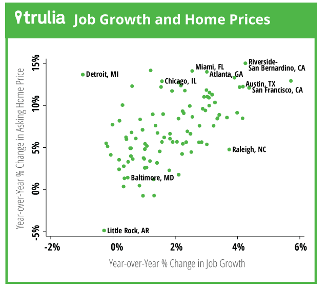
Trulia’s blog provides another important contribution about housing costs. The most recent post includes the graph above. This graph reinforces the evidence that the price of housing is largely determined by the need for housing and the amount available. You might remember previous graphs they’ve produced showing the connection between costs and units built or between costs and permits approved.
Trulia’s graph doesn’t look at the actual number of units built, but it does make an important point about population growth. Frequently people make the mistake of thinking that the number of people moving to an area is the same as the number of people who wish to live in that area. A common erroneous assumption is a nearly 1:1 relationship between units built and new residents. Unfortunately, cities don’t work like that. Instead, most growing areas would likely grow faster if they had more housing, indicating that there are people who would like to live there but can’t. In other words, it’s hard to figure out what the need for housing actually is. Trulia tries to solve this problem by understanding why people move in the first place. In other words, if there are job opportunities in an area, it’s likely that people will move there, especially in an economy with high unemployment.
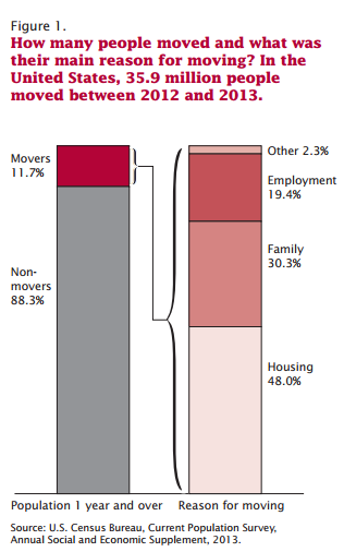 This assumption is reinforced by other research. The Census Bureau acknowledges that a big reason for moving to a new area is employment. The Census Bureau regularly examines why people move. The reasons break into basically 3 categories: housing, relationships, and jobs (as seen in the graph to the left).
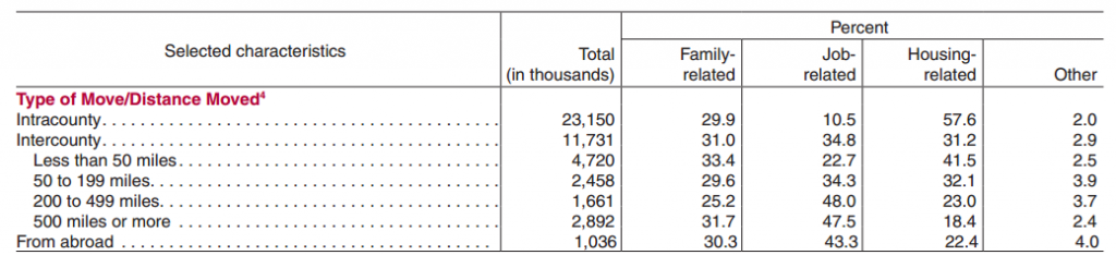
While housing reasons make up more than 48% of the total moves, housing is likely a small motivator for moves to new metropolitan regions. In other words, people may move for better housing, but this doesn’t necessarily change the need for housing in a region if they already lived in that region. To illustrate which moves change how much housing is needed and why those people move, the Census Bureau breaks down moves by distance and reason.
Meanwhile, in the table below, it is quite evident that housing disproportionately motivates the reason for intracounty moves and more than half of the moves of less than 50 miles. In other words, moving for better housing, is the biggest reason people move, but it doesn’t change how much housing is needed. As moves increase in distance, the motivation for moving changes significantly. Jobs and family motivate over 60% of the other moves and account for as much as 78% of moves over 500 miles.
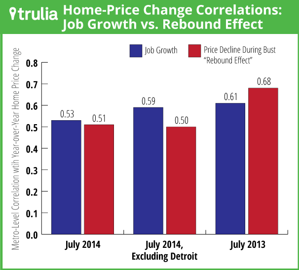
Coming back to the Trulia graph, the decision to measure housing price growth against job growth is logical. Not only is job growth easier to measure than relationships, there is clearly a connection between job growth and increased housing needs. In fact, Trulia measures a .53, correlation (keep in mind correlations can vary between -1 and 1 and 0 indicates no correlation). This is a strong correlation, but shows that job growth alone doesn’t entirely explain housing price increases. This makes sense because there are other factors affecting prices–like the amount of housing available and the other reasons people move.
What’s we’re leaving out
We already mentioned a few things to consider when looking at this graph. For starters, job growth doesn’t entirely explain housing cost growth. This makes sense because we are using job growth as a proxy for the increasing need for housing, but it is apparent that metropolitan areas may see more people who need housing for other reasons, like family relationships. Additionally, we suspect that larger metropolitan areas (like the ones in the Trulia graph) see more growth from relationships than other areas. While we don’t have evidence right now, it seems that a larger metropolitan region has a strong network effect, increasing the number of people moving for relationship reasons.
For example, imagine a family with three members. If two people live in one area, it’s much more likely for the third person to move to that area than for the two other members to move where the third person lives. Regions with more people are more likely to have that effect because they are more likely to have multiple family members living in the same place compared to regions with fewer people.
Another important consideration is that the graph above illustrates costs for homes, not rental prices. It is possible that empirical evidence for rental housing would be different. In the Trulia blog post, the author indicates that rental price growth was also higher in regions with faster job growth, but there is no graph provided or measurement of correlation.
Conclusions
This research simply helps those making the argument that the amount of housing available compared to the amount needed directly affects housing prices. This should be a logical conclusion, and is accepted by most people pushing for initiatives to create affordable housing. With that said, it is continuously challenged or frequently ignored in the public policy debate. Often times, people point towards perceived experiences of their own rent increasing. Or they show that when more housing is built and prices don’t go down. While this might seem like proof that building more housing isn’t the solution it actually indicates the opposite because it ignores whether or not the amount built actually met or exceeded the increasing need for housing.
The evidence continues to suggest that providing enough housing for everyone is the most critical determinant for ensuring affordability. Furthermore, I would personally argue that our political process has failed at getting us closer to sufficient housing opportunity and affordability. It’s arguable that the primary culprit for this political failure is the lack of unity among housing affordability advocates to push for solutions to dramatically increase the development of all housing types. While focusing on a few narrow policies, opponents of more housing have scored political victories that have actually decreased the amount of housing built. It seems that our best bet to overcome opponents of more development is to craft a comprehensive housing plan that explicitly requires building dramatically more housing of all types.

Owen Pickford
Owen is a solutions engineer for a software company. He has an amateur interest in urban policy, focusing on housing. His primary mode is a bicycle but isn't ashamed of riding down the hill and taking the bus back up. Feel free to tweet at him: @pickovven.