At this point, Google Maps has positioned itself as the most widely used map engine for everyday searching and sharing of information. To keep up with consumer wants and needs, every so often, Google will push out minor updates to their map product like adding area-specific event notifications, taxi hailing, and new measuring tools. But this week, Google quietly rolled out a major refresh of its popular service.
While this week’s update builds upon the basic framework of the last iteration, it should be seen as a major departure. Mapheads out there will note that the color scheme, typography, line work and weight, and other theming elements have been substantially changed. But perhaps most interesting is that Google Maps now has a standard feature called “areas of interest”.
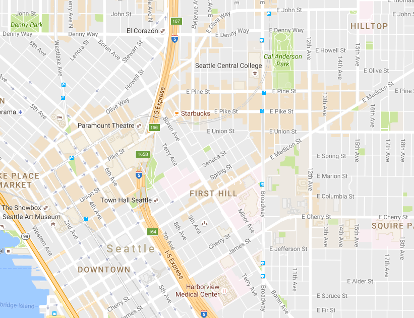
The areas of interest feature is readily apparently with an orange shading. As users zoom in on a map, areas of interest will appear whenever there is a conglomeration of commercial services. Basically, these are the kinds of places that you would expect to find shopping, dining, bars and clubs, and various personal services at relatively dense rates. According to Google, the feature is largely powered by an algorithm that generates the shaded blocks, but Google engineers also do a bit of quality control to curate major cities and destinations.
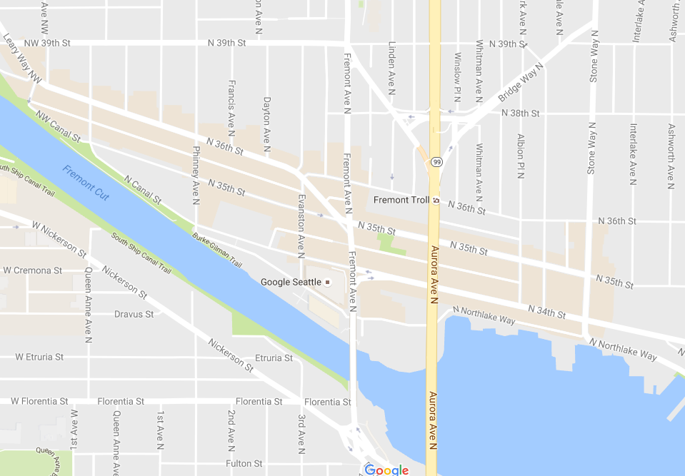
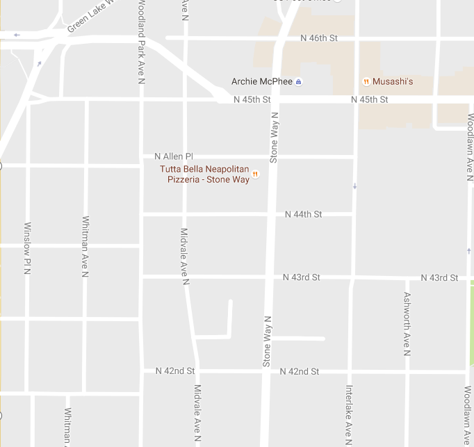
Because of how the algorithm works, zooming in on areas will change what the user sees. When zoomed further out, only the most active areas appear. But take Stone Way in Wallingford for example. As the user zooms in, areas that didn’t have the orange shading further out suddenly appear lit up for individual structures, suggesting that the blocks may not be all that active, but that they do have services that people may want.

The feature seems like a natural fit for Google because it will push users to find businesses, but it’s also a practical improvement for users. Sometimes it’s hard to read maps, especially when they are static with no aerial imagery to tell the story, or at least hint at it. Highlighting areas that are active intuitively tells users that it might be worth investigating further. It’s particularly helpful when users have never visited a place before. So whether you are in Kensington, London or Park Slope, Brooklyn, you can rest assured that you will be able to find a corner store or pub with ease.
So what do you think of this new feature? And what other improvements could Google unleash to enhance urban mapping?