
With a booming economy in Seattle, new development in the city is taking shape at a rapid pace. Scores of large scale development projects dot neighborhoods across the city. But before most major projects break ground, there is a public planning process that involves land use review and often environmental and design review. Locals tend to get wind of proposed projects by the large land use notice signs posted on streets fronting future development sites. For decades, the large white signs with black text and lines have seen little change–last getting an update in 2006. But that could all soon change.
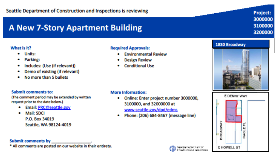
On Monday, the Seattle Department of Construction and Inspections (SDCI) published a draft version of a Director’s Rule that could substantially alter the design of the large land use notice signs–which measure a whopping four feet by eight feet. Key project details would be emphasized with a new layout and color (Seattle blue) while maps of proposed site layouts would give way to a rendering of the proposed project and general locational map. In many ways, the proposed changes to the notice signs seek to retain features already readily available through the current design of the signs, but the reformatting attempts to daylight more meaningful information to the average reader.
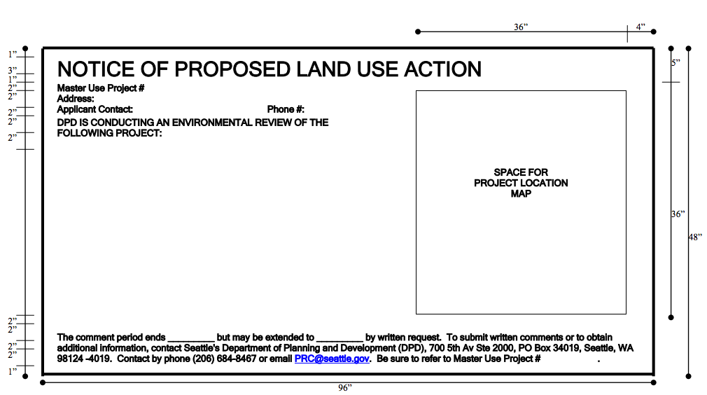
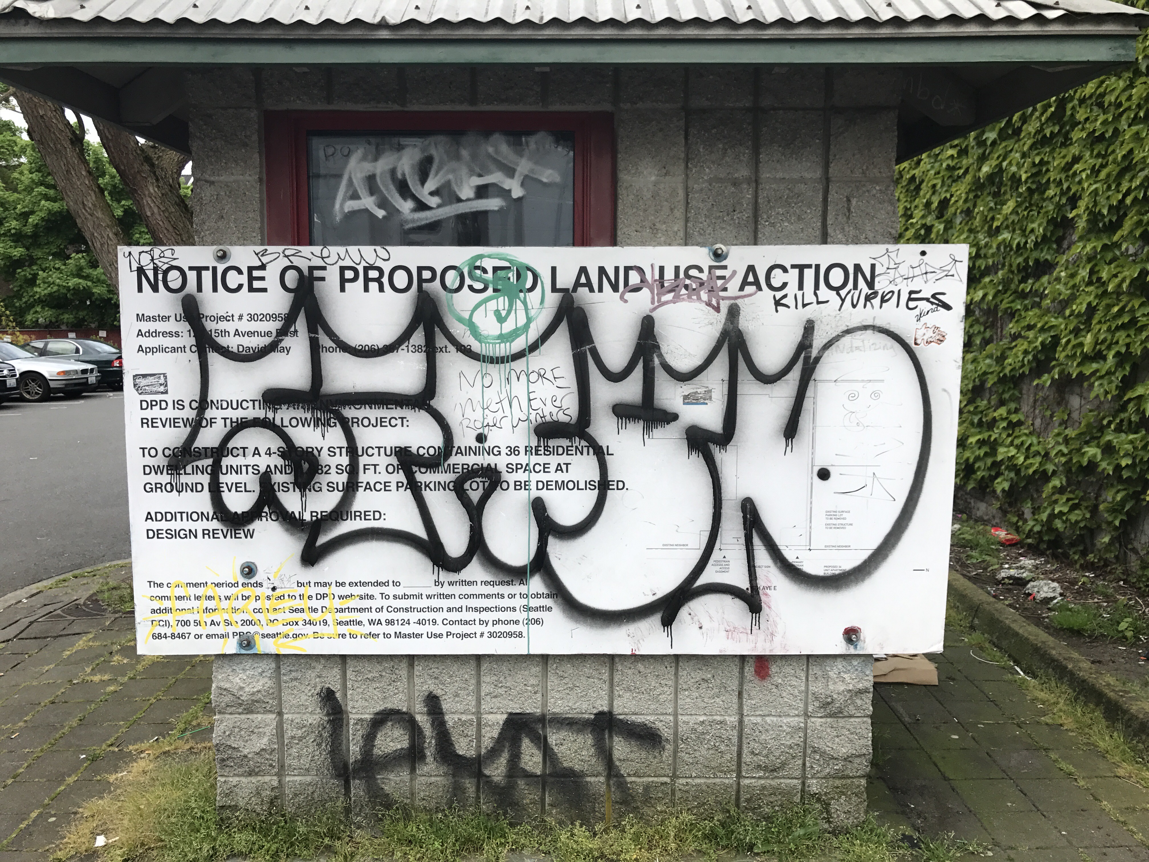
Seattle’s land use notice signs are often a derided feature of the urban landscape, falling victim to vandalism and defacing. For most signs, it’s not long before graffiti appears on the face of the sign rendering the importance and purpose of the signs moot. Technically, the project applicant is responsible for maintaining the signs in good condition until the notice is no longer required. In practice, it’s hard for many applicants to ensure that the signs are clean and readable. But the risk if a sign is defaced or removed from the site is postponement of application review and even the need to fully re-notice the project.
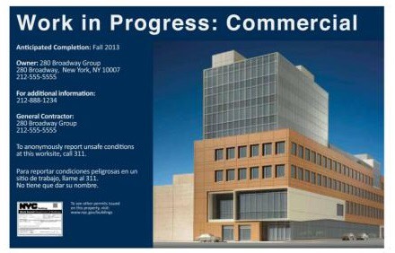
The primary impetus for changing the design of Seattle’s land use notice signs is to make them more usable and accessible to the average person, but there could be an unintended benefit with the change. Well-designed signage may be less likely to become a target for vandalism if it’s considered to be adding to the quality of a space. Seattle has an opportunity here to do just that. In cities like New York City where development projects are heralded with high quality “Work in Progress” signs, the scale of sign vandalism is considerably less than in Seattle.
Seattle’s new approach to land use notice signs is not all that dissimilar to what other cities do. For instance, Vancouver, British Columbia overhauled their notice signs about two years ago to provide relevant project details in a very simple format:
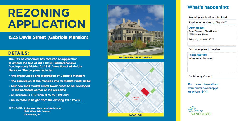
The information on the notice signs is succinct. Off the bat, the sign identifies the type of application being proposed in boisterous text. The scope of work proposed placed just below in a thorough but readily accessible manner for most readers. Imagery is used to graphically depict the proposed project and its location. Contact information, opportunities to be involved in the process, and who will be deciding upon the proposed action are also clearly outlined. But perhaps most importantly, the signs are colorful, helping to add meaning to its contents and make it an attractive feature for the public realm.
This is all consistent with recommendations made by a Vancouver task force in 2013 that specifically called for changes to the city’s land use notice signs:
It is time the City of Vancouver brought public signage into the 21st century. Too many of the notification signs, particularly related to planning and development, are written in outdated, technical language that makes it difficult for people to understand. These signs use small fonts, lack colour, and seem to encourage people to ignore them, rather than to read and be informed by them.
Toronto also uses a well-designed approach to its large land use notice signs:
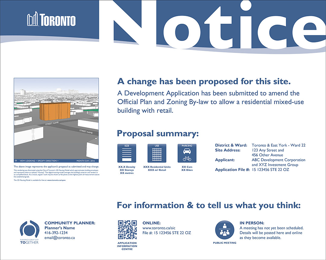
While a lot more real estate of the sign board is given over to the “Notice” text and white background, Toronto’s design highlights key data for development proposals in a simplistic way categorizing details into three buckets: size, use, and parking. A rendering of the proposed development, a project file number, and finer city contact details are also provided.
The proposed changes to Seattle’s signs indeed share some commonalities with the Vancouver and Toronto approaches, but there are perhaps other attributes that could be worth incorporating into Seattle’s new signs. For instance, Vancouver’s design puts the project design and location front and center on the board and uses a colorful background to highlight the project details. Together, these frame the main information that the average reader is typically looking for. Toronto uses icons to convey the message of project scope in terms density and height, amount of units and retail space, and number of bikes and cars.
Additionally, four specific changes that could greatly enhance usability of the signs include:
- Providing links to webapps like Shaping: Seattle Buildings or Seattle In Progress (both of which provide a medium to comment and review project documents);
- Creating a memorable shortlink for “seattle.gov/dpd/edms” like “seattle.gov/landusenotice”;
- Using a more contextual site and vicinity map that draws attention to urban form; and
- Giving more real estate to imagery (preferably toward the center or left since most people read left to right).
According to Sue Putnam, the planner shepherding the changes, SDCI has already received a variety of comments on the draft Director’s Rule that could push the department to make further revisions to the proposed sign design before a final rule is adopted and implemented. SDCI is accepting comments on the draft rule through May 23rd.

Stephen is a professional urban planner in Puget Sound with a passion for sustainable, livable, and diverse cities. He is especially interested in how policies, regulations, and programs can promote positive outcomes for communities. With stints in great cities like Bellingham and Cork, Stephen currently lives in Seattle. He primarily covers land use and transportation issues and has been with The Urbanist since 2014.