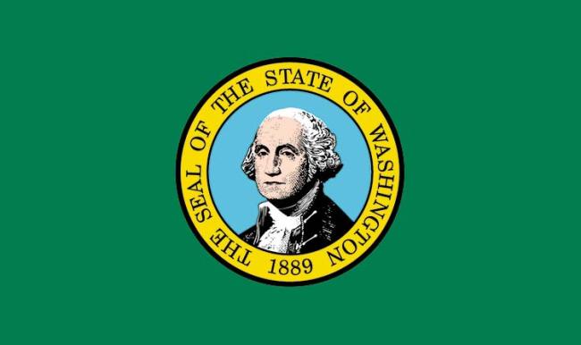
From the sublime (New Mexico) to the ugly charming (Maryland) there are excellent state flags in the United States. Washington’s is not one of them. Although it stands out from the other “state seal on a bedsheet” flag designs by having a green background instead of blue, our flag is terrible. Or, as explained by CGP Grey, it’s barely a passing grade among the country’s flag failures.
This year, Washington’s flag is a century old. That’s 100 years too long for this dreadful, amateur sackcloth. There have been a number of initiatives to change the flag, most recently to Bradley Lockhart‘s handsome depiction of mountains, fields, and sky. The hidden WA feels a little FedEx arrow, but it’s vastly better than what we’ve got.

Vexillology is the study of flags, and there are rules. It starts with NOT HAVING WORDS ON THE FLAG and goes from there. Easy to remember, meaningful, and recognizable really are key. For a primer on what makes flags good or bad, Roman Mars’ fantastic TED Talk about city flags is a must see.
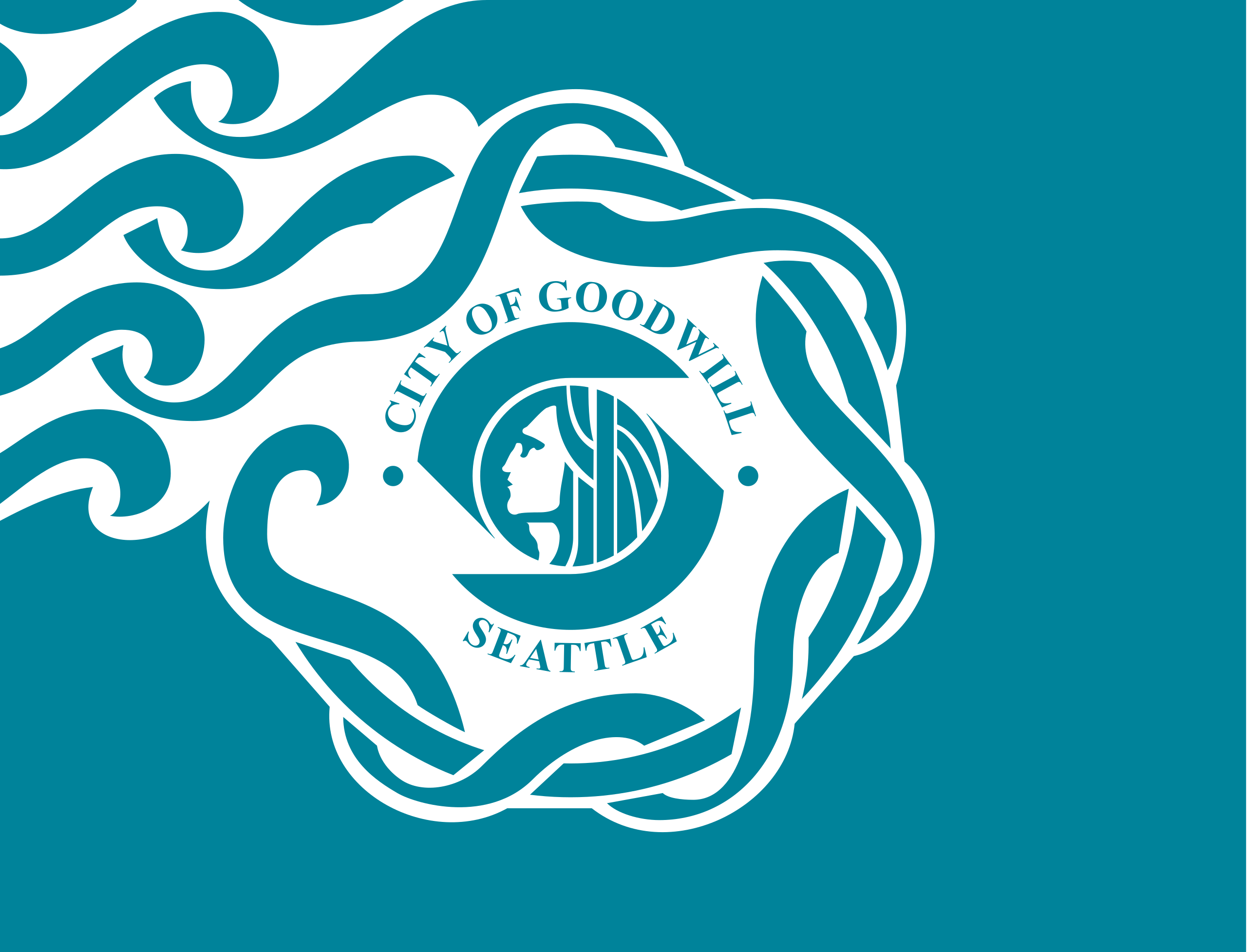
Yes, Seattle’s flag and its portrayal of — who knows, the moment of conception? — can use an update too. Just, ugh. F tier.

Ray Dubicki is a stay-at-home dad and parent-on-call for taking care of general school and neighborhood tasks around Ballard. This lets him see how urbanism works (or doesn’t) during the hours most people are locked in their office. He is an attorney and urbanist by training, with soup-to-nuts planning experience from code enforcement to university development to writing zoning ordinances. He enjoys using PowerPoint, but only because it’s no longer a weekly obligation.