
Have you ever wanted to see where new transit investments are planned or underway in North America? Well now you can. With the help of Steven Vance, Jonah Freemark over at The Transport Politic has hobbled together a comprehensive map called Transit Explorer. The map depicts where new alignments and facilities for high capacity transit investments are proposed, planned, and under construction. Over 40 different metropolitan regions are shown in amazing detail with names, funding, and projected opening dates. Map users can zoom to metros like Vancouver, BC, Portland, and even our own Seattle/Puget Sound Region to see individual corridors planned for investments.
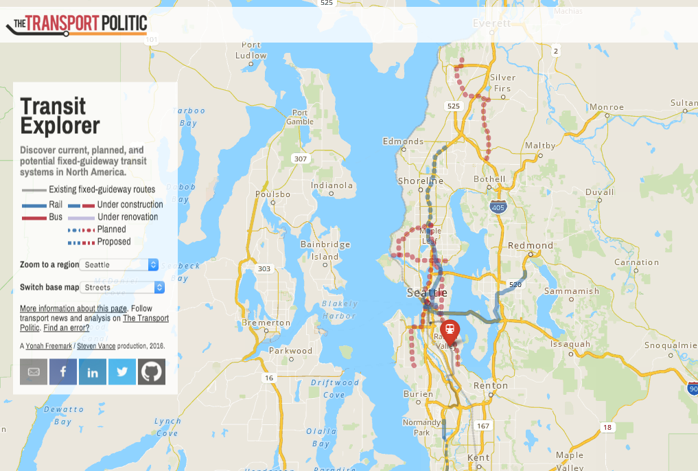
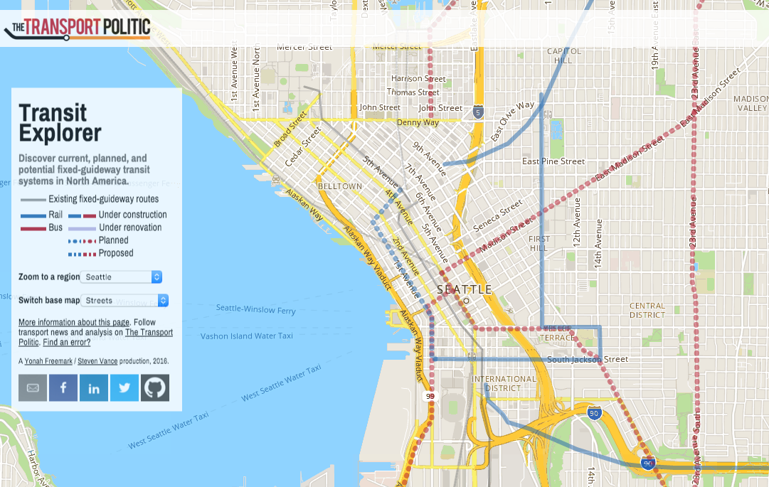
High capacity transit corridors are first broken by their mode type. Bus corridors appear in red while rail corridors appears in blue. Project corridors are then noted by their status. Projects under construction appear with normal solid lines; planned corridors are dotted lines; and proposed corridors are dashed lines. Existing fixed-guideway routes appear as thin grey lines.
In the Seattle area, Transit Explorer shows a variety of projects that are proposed, planned, and under construction. These include projects as far flung as the Tacoma Link streetcar extension and Swift II bus rapid transit in Snohomish Counth. Transit Explorer also shows projects close-in to Seattle like the under construction East Link extensions and Seattle’s proposed RapidRide+ corridors.
Transit Explorer also provides a wealth of information for each transit corridor, which can be unlocked by clicking on individual corridors. Transit Explorer displays corridor information as relevant and available for a project. Typically, information bubbles will show the following types of information:
- Project name and length;
- Estimated cost and ridership;
- Project status and how it’s funded;
- Projected construction timeline and opening date; and
- Technology type and general grade typology.
Many users will note that a number of proposed corridors have not yet been added to Transit Explorer. But as this is a work in progress, Freemark and Vance plan to carry the project forward by adding content as they go along. Users, of course, can help out by sending them feedback and information about local projects.
In any case, take the interactive map for a spin and then share your thoughts on it here.

Stephen is a professional urban planner in Puget Sound with a passion for sustainable, livable, and diverse cities. He is especially interested in how policies, regulations, and programs can promote positive outcomes for communities. With stints in great cities like Bellingham and Cork, Stephen currently lives in Seattle. He primarily covers land use and transportation issues and has been with The Urbanist since 2014.