“Barriers to spatial mobility are barriers to social mobility.” – American Apartheid
Every morning Sandy McKay gets in her Volvo hatchback and joins the flow of people pouring into Seattle, driving about 25 miles from Everett to North Queen Anne. She says the commute usually takes about an hour. Oftentimes she isn’t so lucky. Whether it’s an overturned salmon truck or a swarm of bees, the duration of her commute is beyond her control and occasionally exceeds two hours. Many people in the Seattle area share Sandy’s experience. They waste huge amounts of time in traffic. The blame often lands on the region’s inadequate transportation system but the fault doesn’t end there. High housing costs are a major part of the problem.
Like many people with longer commutes, even if Sandy wanted to move closer, it’s unlikely she could without a subsidized unit. A recent application process for 110 subsidized units in Beacon Hill drew over 1,400 people. Like the Beacon Hill applicants, 71 year-old Sandy might need to sleep in line overnight and skip a day of work, just to apply. Subsidized housing in prime locations is so scarce that the application process perversely resembles lines outside popular rock concerts. So instead of moving closer to central Seattle, Sandy sits in traffic while her dog, Abbey, eagerly awaits her return.

Sandy, like many commuters, tries not to dwell on the negative. She listens to NPR on the drive and leaves work promptly, trying to beat the traffic. She doesn’t like leaving Abbey home alone for too long. But the location of her housing deeply affects her life. Not only does she have a long commute, she describes her neighborhood as a “rather seedy end of town” and drives to the QFC that is only a block-and-a-half from her house. Sandy says, “They put senior housing in places that aren’t desirable for other types of housing.” Unsurprisingly, this is the housing that takes Section 8 vouchers and serves people aged 55 or older.
The importance of location is often ignored entirely during discussions about housing costs. Instead, people focus on supply or total number of subsidized units. Location is often considered to be just another amenity, as if it were an appliance or an extra bedroom. But paying more for an apartment with a short commute isn’t the same as getting granite countertops.
The tendency to overlook the role of location stems from the most common paradigm for understanding housing prices, a simple supply-demand narrative. The narrative paints a single average price for all housing in an area. Areas are often arbitrarily defined by city limits or a metro region. A simple supply-demand graph aggregates all housing supply and all housing demand but ignores the role of location.
Inclusionary zoning policies are meant to address the importance of location. At the heart of inclusionary zoning is a moral and pragmatic assertion that all neighborhoods should be mixed-income. Without inclusionary zoning or any other form of government intervention, housing prices tend to make neighborhoods homogenized.
A simple supply-demand narrative fails to explain the relationship between price and location. It might show what average prices are in the Seattle metro area but it can’t explain why Sandy is paying 50% of her income to live in a 528 square foot apartment in Everett and still commuting an hour to work. However, the relationship between price and location can be explained by an alternative model known as the bid-rent curve. This model helps illuminate why affordable housing isn’t just about building lots of units but also about where those units are located. The bid-rent curve describes the harmful market forces that lead to income segregation. It shows that the affordable housing crisis isn’t only a crisis of not enough housing or low enough prices. Rather, we face a crisis because we lack low cost housing in specific locations. Overall, the bid-rent curve shows why Seattle needs inclusionary zoning.
Simple Supply-Demand Versus The Bid-Rent Curve
Imagine if housing costs across the entire United States were expressed by one, simple supply-demand graph. This graph would tell the narrative that adding housing would reduce prices. Yet it should be obvious that more housing in west Texas wouldn’t affect prices in Seattle.
A similar mistake is frequently made when discussing housing in metro areas; people often aggregate housing supply within an entire city or region to explain price fluctuations. An example of this can be seen in a recent article by Sanjay Bhatt at The Seattle Times. Bhatt aggregates the supply of housing throughout all of King County:
King County is experiencing the worst shortage of homes for sale in more than a decade, driving prices higher and keeping more would-be buyers in apartments.
Bhatt’s analysis implies that adding homes in King County would reduce prices. It’s a reasonable assertion on the surface but glosses over important nuances. Would additional houses in Skykomish lower home prices on Mercer Island? What about Sea-Tac? Would additional houses in South King County affect Sandy’s rent? The location where housing is built and where rents actually decrease are important details and can’t be generalized to an entire county.
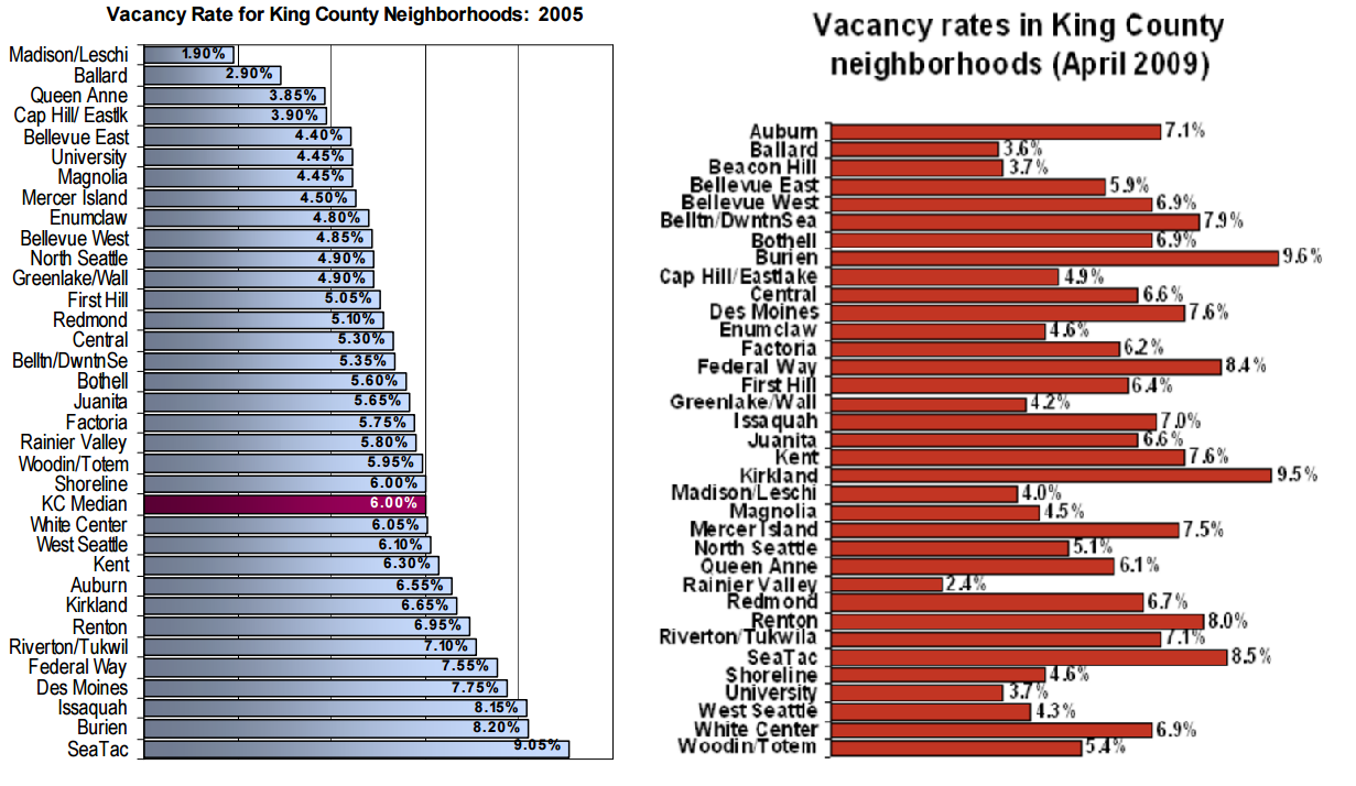
If we look more closely at specific neighborhoods, it becomes even clearer that housing markets can’t be aggregated into a single metro area, let alone a county. Examples from 2005 and 2009 show that vacancy rates vary dramatically within the Seattle metro area. There’s nearly a 7% difference in vacancy rates between Leschi and Sea-Tac in 2005. It simply isn’t accurate to generalize King County or Seattle’s housing prices when vacancy rates vary so much within a short drive. Again, the simple supply-demand explanation of housing prices skips these details because it ignores location.
On the other hand, the bid-rent curve connects supply and demand to specific places and helps explain some urban housing phenomena, such as gentrification.
What Is The Bid-Rent Curve?
Overall, the bid-rent curve explains how location prices — the value of a place — are determined. Its origins are found in an observation by David Ricardo about agricultural land value. Ricardo saw that agricultural land values were connected to the revenue the land produced. Land that earned more revenue commanded higher rents.

Ricardo’s contemporary, Johann Heinrich von Theunen, created a simple model to describe land value. He observed that revenue produced by agricultural land, and by extension the land’s value, were affected by transportation costs. If the cost of transporting goods to the nearest market was lower, the land on which those goods were produced would earn more revenue and consequently the land value would be higher. If transportation cost increased, land value would decrease. Both the earnings and costs of land were correlated with location. He also observed that the value of the land affected how the land was used. He formalized a model showing how cities were organized at the time and laid the groundwork for economic geography.
The concentric rings represent where different industries locate based on earnings from land and the cost to bring goods to the market (the center). The further an industry is from the market, the higher the transportation costs. Industries on the outer ring often require the most land but have low transportation costs, such as ranching.
While von Theunen’s model applied to the cost of agricultural land, William Alonso extended the model in the 1960s, applying it to modern cities and residential land values. Alonso’s model described rents in metro areas. He adopted von Theunen’s logic, guessing that prices would be highest in central cities due to lower transportation costs. He theorized that cities would organize around a central business district.
Alonso’s model isn’t perfect, but the underlying concept is strong. People pay more for a better location. His added details show that land values are driven by bidders competing with each other for the best locations.
It’s currently impossible for everyone in the Seattle region to live within a 10-minute walk of a light rail station. There are only a handful of good locations within walking distance of your job, friends or family. Sandy wants to live on the north side of Seattle because it’s closer to her family. These examples demonstrate why location can’t be compared to most home amenities, like appliances or finishes. Nearly every location is unique by definition. Most other amenities can be located anywhere and play a more trivial role in the cost of housing. This is why a 711-square foot, one-bedroom apartment in Capitol Hill can cost more than a 2,070-square foot, four-bedroom, detached home in Bryn-Mawr. Housing prices in cities are largely determined by location prices.
For urbanists, this is a critically important consideration. Most urbanists want to make cities a more desirable place to live. Housing prices may seem like the throttle on people moving to cities but location prices are the real problem. As the desirability of a city goes up, so do location prices. Breaking this dynamic requires urbanists to understand the key drivers of location prices. The bid-rent curve shows how location prices are established and exposes the weaknesses of a simple supply-demand narrative.
Compare And Contrast Bid-Rent Curve To Supply And Demand Graph
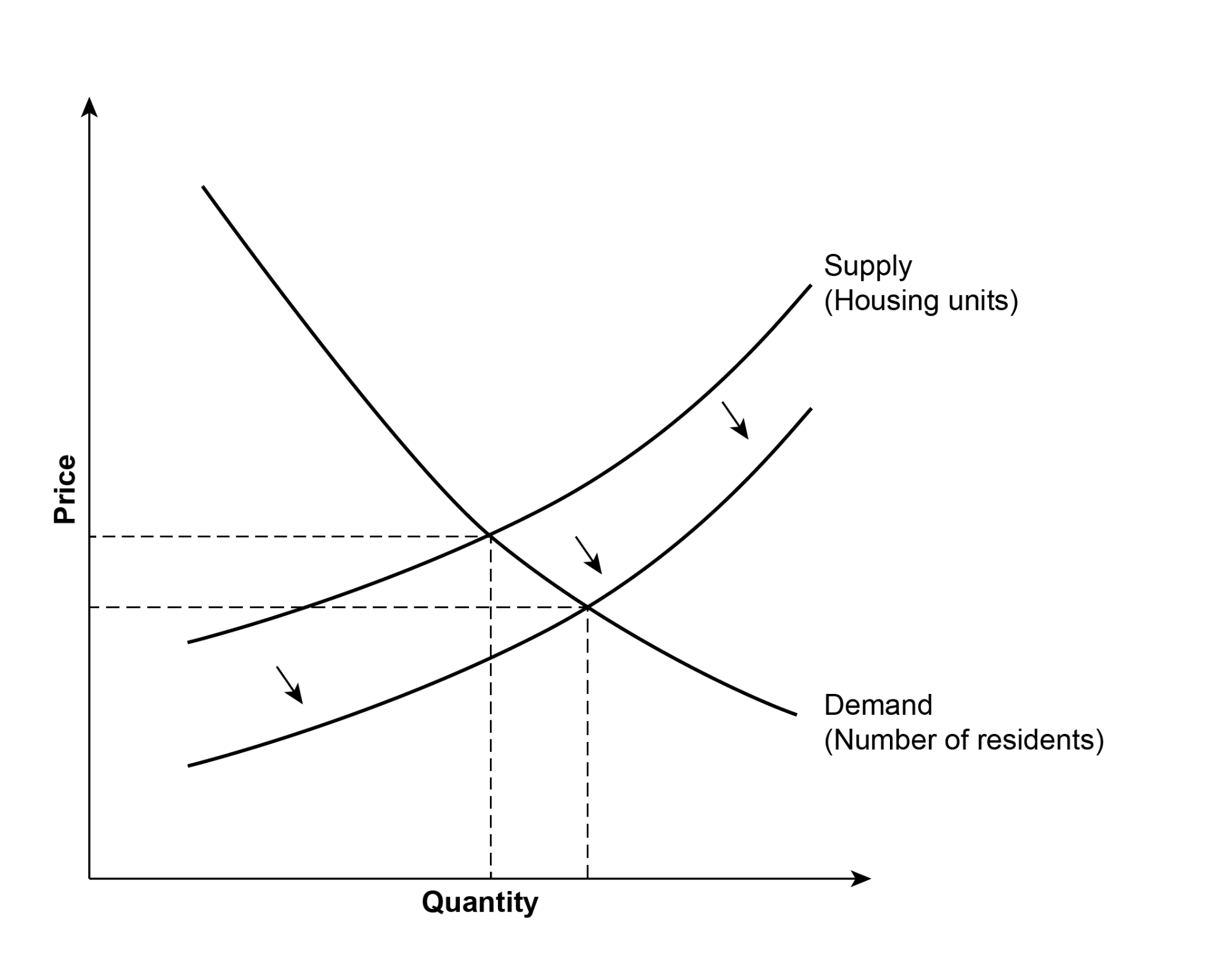
A traditional bid-rent curve looks similar to the image below. Von Theunen’s concentric circles are at the bottom of the image. Above them are three lines representing bidders and the price they’ll pay at different locations. The center is the most desirable area and has the highest bids from everyone. The periphery is the least desirable and has the lowest bids. It turns out the bid-rent curve illuminates some observations that are invisible using a simple supply-demand graph.
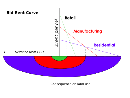
First, housing competes with other uses, such as retail and manufacturing. In fact, all bidders compete with each other and will have different bids. Traditional supply-demand graphs typically aggregate all demand into a single line, usually showing only residential supply-demand when discussing housing costs. But competing uses affect where residential bidders locate and those uses can be explicitly shown in a bid-rent curve, unlike in a supply-demand graph. The bid-rent curve makes an interesting tension apparent. Residential and commercial uses both want to be close to each other. As one use grows, the desirability for the other use also increases, yet both are in competition for the same space.
Second, bidders value locations differently. The graph above shows that the slope of each line is different. The slope indicates the amount bidders are willing to pay as distance from the center increases. Retail can generate more revenue in a central area than an outlying area because central stores are accessible to more customers. Stores that are accessible to more customers can earn more revenue, increasing the ceiling a retailer can bid for the location. Residential users want to live close to their jobs, but low transportation costs increase the appeal of outlying areas where people can get more home for their dollar. In fact, as more people move to a location, that location becomes more valuable to commercial uses and the commercial bids increase in relation to residential bids, possibly pricing out some residential users. Unlike a supply-demand graph, a bid-rent curve explains why sprawl and central business districts might be normal outcomes, rather than mixed neighborhoods.
Third, the bid-rent curve illustrates how real estate markets are segmented. The example graphic above differentiates between retail, manufacturing and residential but the model can incorporate other segments. For example, the model could segment residential bidders between high-income, middle-income and low-income. Doing this would illustrate an extremely important insight: High-income renters outbid lower-income renters in the most desirable locations. This additional detail explains why neighborhoods segregate by income. Income segregation is entirely ignored by a simple supply-demand graph. By explaining income segregation, the bid-rent curve also explains the need for inclusionary zoning.
Explaining The Mechanics Of Income Segregation
The specifics of inclusionary zoning policies vary, but they generally require newly constructed buildings to offer units at rents that are affordable to people with low incomes. Inclusionary zoning advocates believe the policy directly addresses the real affordable housing problem, the need for subsidized units in desirable areas, specifically amenity- and opportunity-rich neighborhoods. Most metro areas have low cost housing somewhere but this doesn’t mean that housing is affordable. Affordable housing must couple low prices with great location. Affordable housing needs to be located in amenity- and opportunity-rich areas. Inclusionary zoning, unlike housing vouchers, the affordable housing levy, or MFTE, mandates that new construction will always include space for lower-income renters.
This policy differs from solutions that simply liberalize zoning codes. To illustrate why, imagine a neighborhood that adds housing. People relying on a simple supply-demand narrative would imagine the graph on the right. If more housing were built, rents would fall and people across a wider range of incomes would be able to live in a neighborhood. The outcome of this narrative appears to be a net benefit and leads most people to focus on liberalizing the zoning code. These advocates are making an extremely important argument. In most US neighborhoods, a more liberal zoning code is extremely important. There is simply no reason to outlaw duplexes.
I’ll acknowledge that this explanation ignores some nuances. For now though, assume that the price of housing decreased and more people have housing. From that assumption, let’s look at this same situation using the bid-rent curve. Below is a modified bid-rent curve graphic:
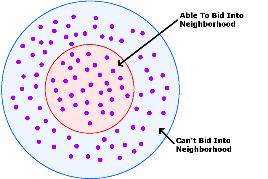
The dots represent people who want housing. The outer circle ecompasses all the people who want housing in a neighborhood. The inner circle shows the people who were able to afford the limited amount of housing in the area. At the beginning of the illustration, 100 people are competing for 30 housing units, leaving 70 people to find housing somewhere else. After building more housing, 60 people can live in the neighborhood.
It seems that we reach the same conclusions with the bid-rent curve as the simple supply-demand graph. Building more housing gives more people access to an area. If we stop here, the supply of housing is the only problem we have to worry about. But this story gets complicated when we add a little color. One of the advantages of the bid-rent curve is that it allows us to show how the housing market is segmented by income. To illustrate, I’ve added colors indicating renter segments. Below is a mixed-income area, with red dots indicating high-income renters, green dots indicating medium-income renters, and blue dots indicating low-income renters.
Now imagine this neighborhood adds housing. Since new housing is almost always the most expensive housing (measured by cost per square foot), it tends to serve higher bidders:
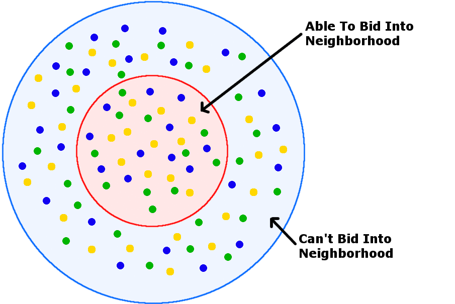
The animation shows a mixed-income neighborhood turn into one that’s mostly composed of high- and middle-income renters. This happens even assuming that no low-income renters are directly displaced. Over time, low-income households (like all households) will naturally move. If a neighborhood fails to attract new low income households it will slowly march towards homogenization. Discussions about gentrification often focus on what happens to people living in the neighborhood. But this focus overlooks how neighborhoods change. Mixed-income areas only maintain income integration if they continuously attract new low-income residents. Furthermore, even if cities don’t have an affordable housing crisis and low-income households have housing, neighborhoods, cities, and metro areas can still be income segregated. In fact, most places are income segregated. This isn’t by accident.
[Aside: I want to acknowledge there are many overlooked nuances in these simplified models. Some of these include:
- Additional housing in an area may not always mean more people. Space could simply be absorbed by existing residents, larger apartments, vacation homes, pied-à-terres, Airbnbs or other competing uses.
- Gentrification is about more than income: culture, race, and other identities are critically important.
- New housing may be more expensive per square foot, but some low-income renters will sacrifice space for location. In other words, diverse housing typologies — backyard cottages, row houses, micro-apartments — can help maintain mixed-income neighborhoods.
- Some low-income renters may also pay a higher percentage of their income for housing than high- or middle-income renters, outbidding them for apartments.
- Gentrification can have silver linings. For example, low-income homeowners may benefit from rising property values. New high- and middle-income residents can boost revenue going to local businesses. There is some evidence of this in peer reviewed research.
- Existing housing may ‘filter’over time, becoming less desirable and eventually providing lower-cost options.
- Segregation isn’t just about income. For example, there’s overwhelming evidence that race and racism is a cause of segregation all by itself, independent of income.
Many of these nuances are very important and deserve a lot of ink but are beyond the scope of this article.]
More housing likely helps reduce rents within a metro area, but the bid-rent curve shows that those effects can be unevenly distributed. More housing can reduce average rents on a metro level while also increasing rents in some neighborhoods. More housing can cause gentrification even without displacing anyone. The alternative bid-rent model formalizes the experience of residents in neighborhoods experiencing gentrification.
But that doesn’t mean we shouldn’t build more housing. Evidence suggests that affordability outcomes are even worse in neighborhood that restrict new housing. The importance of this can’t be overstated, especially considering the vocal opposition to development in Seattle. The market forces driving income segregation are impossible to address without more housing. But the call for more housing must complement, rather than undermine, efforts to grow equitably. Adding housing isn’t a panacea. It’s necessary but not sufficient.
If we want to achieve mixed-income communities and create equitable growth, our only option is to purposefully build housing for low- and middle-income residents in the most desirable neighborhoods. This aim informs the work pursued by affordable housing advocates over the last two decades and is the keystone element of the HALA’s inclusionary upzone recommendation, referred to as mandatory housing affordability.
Beyond Hypotheticals: An Empirical Understanding
It turns out that these hypothetical examples closely match what is found in research. Most people would have a hard time thinking of any cities in which incomes weren’t segregated spatially and there is even research supporting this. A paper on Paris developed a bid-rent curve model that predicted the empirical data on housing costs in the city. The model showed high prices in the center of the city and a declining curve of prices outwards from the center.
evidence is that prices are high in the center. As a first step, one may look at the average price as function of the distance to the center. Quite remarkably, there is a marked trend for a decrease of prices from the center, so that the monocentric model can be seen as a first order approximation of the Parisian market.
The authors note that if housing costs are at all correlated with income, there is likely income segregation in the city. Not only do rental prices in real cities resemble the dynamics of the bid-rent curve, the process of gentrification appears to match the previously shown bid-rent graphics.
Findings from a remarkable research paper about gentrification, published by the Federal Reserve of Philadelphia found that:
… gentrification is associated with some positive changes in residents’ financial health as measured by individuals’ credit scores. However, when more vulnerable residents (low-score, longer-term residents, or residents without mortgages) move from gentrifying neighborhoods, they are more likely to move to lower-income neighborhoods and neighborhoods with lower values on quality of-life indicators. The results reveal the nuances of mobility in gentrifying neighborhoods and demonstrate how the positive and negative consequences of gentrification are unevenly distributed.
This research paper uses a novel dataset — anonymized credit information — that allows an extremely granular examination of residents’ behavior and demographics. Its findings are closely aligned with seven other studies that found little direct displacement (defined as increased rates of out-mobility by lower-income residents) in gentrifying neighborhoods. This research found that mobility only increased 3.6% for residents in the most rapidly gentrifying neighborhoods compared to non-gentrifying neighborhoods.
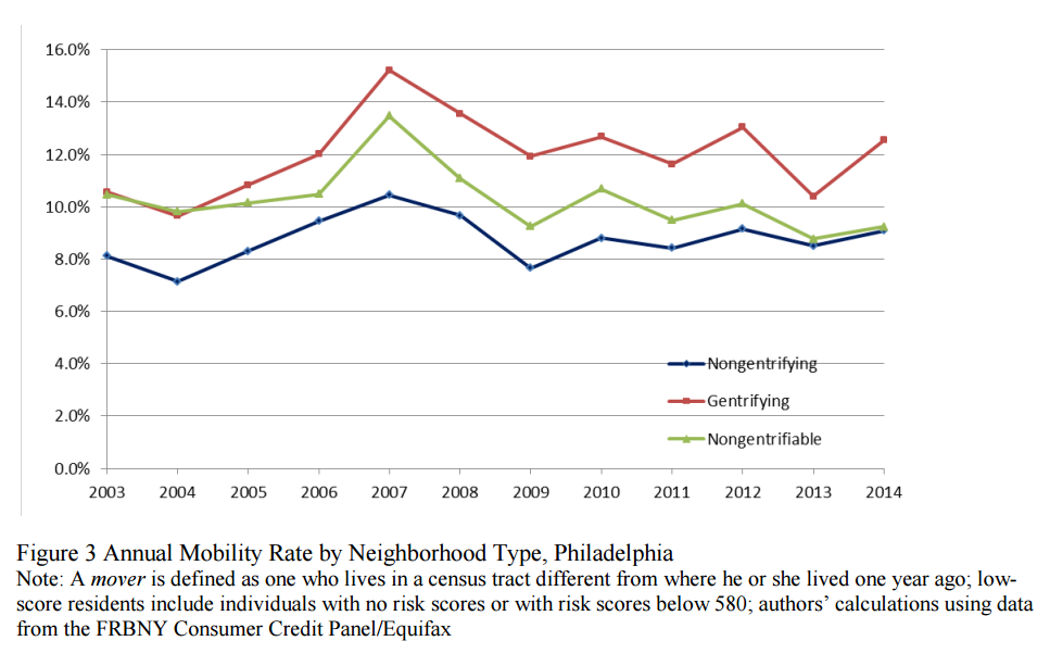
However, as the bid-rent curve examples make clear, even if gentrification doesn’t directly displace people, it can still cause income segregation and hurt lower-income residents. The research supports this assertion. The authors found that people who were likely renters were most likely to move and that people with the lowest credit scores moved out of gentrifying neighborhoods at higher rates than they moved into them.
In short, outmovers from gentrifying neighborhoods are more likely to be replaced by inmovers who are younger and have higher credit ratings; this pattern, instead of higher rates of out-mobility by more vulnerable existing residents, helps explain the demographic changes occurring in gentrifying neighborhoods
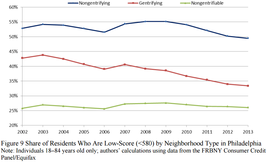
This last observation might be called indirect displacement. Nearly everyone moves occasionally, but when the lowest-income residents move, they have fewer neighborhoods to choose from and the research shows their new neighborhoods are usually worse. Even without any direct displacement, gentrification can still have harmful repercussions. As the graphic shows, the dynamics of moving can increase income segregation. The research isn’t conclusive but the authors acknowledge it is likely:
Low-score movers from gentrifying neighborhoods were more likely to move to tracts with a similar or, for intracity movers, higher concentration of non-Hispanic black residents and a substantially lower share of adults who have attained a college degree (see Table 12). This pattern reinforces existing demographic differences between low- and high-score movers’ neighborhoods, suggesting that outmigration from gentrifying neighborhoods may have resulted in increased demographic sorting.
The tendency toward segregation sounds grim, but the negative findings shouldn’t be overstated. There were positive outcomes for low-income residents in gentrifying neighborhoods too, such as increased incomes. Again, this isn’t an argument against building more housing. Most research bolsters the argument to build more private-market housing:
with low construction levels, a census tract’s probability of experiencing displacement was 47 percent, compared to 34 percent with average construction levels, and 26 percent with high construction levels.
Even if we acknowledge that market forces may contribute to income segregation, that still doesn’t prove we should care about mixed-income neighborhoods. Yet most Seattleites do care. When I asked Sandy what she thought of requiring developers to build affordable housing, she articulated the general points often expressed by affordable housing advocates, saying “there are people that love living in the city and they should have that right, to live in the city. They shouldn’t have to be a multi-millionaire to live in the city.”
Is caring about mixed-income neighborhoods just liberal worrying run amok? Shouldn’t we focus on education or the social safety net?
From the mid-nineties up until recently, this criticism may have seemed valid. Starting in 1994, the Department of Housing and Urban Development conducted a randomized experiment called Moving To Opportunity (MTO). The MTO experiment attempted to measure the impact of neighborhoods on social mobility. It compared low-income people who moved to a wealthier neighborhood to those moving to a less wealthy neighborhood and those that stayed in the same neighborhood. For over ten years, the evidence seemed to show that neighborhoods didn’t have a big impact on social mobility.
But last year Raj Chetty, Nathaniel Hendren, and Lawrence Katz published a powerful re-analysis of the evidence that dramatically transformed the popular consensus. Using multiple studies, they demonstrated that mixed-income neighborhoods are a critical ingredient to social and economic mobility. “…the area in which a child grows up has significant causal effects on her prospects for upward mobility,” they concluded.
This study is especially remarkable because it shows a clear divergence between the impact of neighborhoods within the same city. Below is an example of three New York neighborhoods that are a subway ride apart but cause divergent outcomes of social mobility.
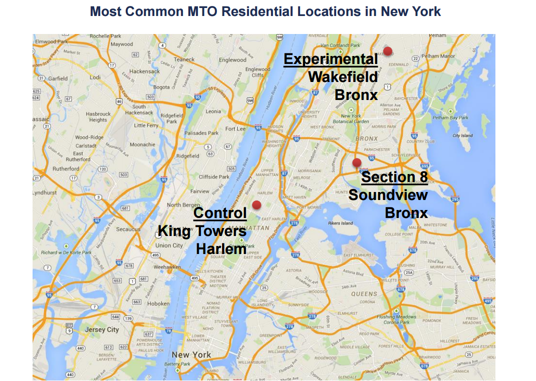
This granular focus on neighborhoods emphasizes the point that housing costs can’t be viewed simply from a regional or city-wide perspective. Differences between small areas have a causal impact on educational attainment, earnings, and even marriage.
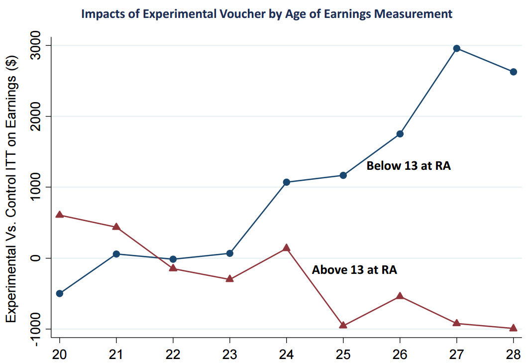
It’s hard to overstate the importance of this research. It’s spurred even further research that indicates the impact of neighborhoods may be larger than most people initially thought. The newest research shows even bigger impacts on children that were displaced into nicer neighborhoods, potentially overcoming the self-selecting bias of parents that chose to participate in the Moving To Opportunity study.
Displaced children are 9 percent more likely to be employed and earn 16 percent more as adults.
With the knowledge that specific neighborhoods have a significant impact on social mobility, the next question is how to ensure access to great neighborhoods. Chetty, Hendren, and Katz indicate that zoning, subsidies, and infrastructure impact access but acknowledge their research doesn’t indicate a best policy.
These studies make a compelling case that gentrification may contribute to income segregation. A historically mixed-income neighborhood that gentrifies will slowly shift to a more income-segregated neighborhood without government intervention. The goals of liberalized zoning, building enough housing to ensure everyone can live in our metro area, may be the easy challenge. The harder challege may be pushing back against the market forces that cause income-segregated neighborhoods. Inclusionary zoning uniquely and directly addresses this problem.
The Urbanist Politics of Inclusionary Zoning
Urbanists are a loud and crucial voice for building more housing of all kinds. This advocacy is critical and forms a bulwark against endemic anti-growth politics. Unfortunately, this advocacy is sometimes undermined by focusing on potential negatives from affordable housing policies like inclusionary zoning. Some people think these requirements reduce the amount of housing built, hurting everyone. However, many people believe that a well designed inclusionary zoning policy will reduce housing inequity without decreasing housing supply.
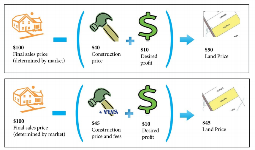
To summarize, developers may see this policy as an additional cost. If so, they have four options. They can choose not to build a project, pass that cost forward to renters, reduce their profit margins, or pass the cost backwards by paying less for land. Only the first outcome, choosing not to build a project, affects the supply of housing and only if that money never goes towards a project. Economic theory suggests the last outcome is most likely over the long run. Eventually, the cost of inclusionary zoning will likely be passed to landowners because developers will bid less on land and landowners have no recourse.
In the case of inclusionary zoning, a lot of the research shows that a well designed program can avoid a decrease in housing supply. Of the five empirical studies that have been completed, only one found a large impact. That study was done by a libertarian think tank and largely discredited. Another study looked at three metro areas and found some impact on the construction of single-family homes in suburban Boston but no impacts in San Francisco. The other three found no correlation between inclusionary zoning and overall housing supply.
This isn’t to say that inclusionary zoning is a panacea. Its biggest and completely legitimate criticism is that it doesn’t produce enough units. Yet this criticism highlights a potential strength of inclusionary zoning. The policy needs new construction to produce units. Often times it fails because of regulations limiting new construction. In other words, inclusionary zoning works best when we also reduce housing limits rather than focusing on construction costs. Consequently, the policy creates a strong incentive for affordable housing advocates to support more construction. This dynamic explains Seattle’s current policy proposal; the city is pursuing upzones while implementing inclusionary zoning.
The housing affordability and livability recommendations are able to bridge the varying interests of developers and affordable housing advocates by coupling inclusionary zoning with upzones. This is a build and capture value strategy.
Land value increases when developers can build more in an area which is why developers support the upzones. But that value is captured through inclusionary zoning which is why affordable housing advocates support the policy. Perhaps surprisingly, this strategy’s ability to align affordable housing advocates and pro-growth urbanists created an unexpected outcome. The lobbyist and anti-growth voices (normally in opposition) became more closely aligned, criticizing a solution that doesn’t fit either ideology.
The Future Of Inclusionary Zoning In Seattle
Not only will inclusionary zoning guarantee mixed-income growth, it will also prove to be a useful tool in the political debate. It’s evident that adding more housing is important. Almost every reasonable argument supports this. But those who oppose changes to single-family zones in our transit-rich, urban villages are willing to sink HALA in its entirety to prevent the construction of more market-rate housing. These critics will claim that changes will lead to gentrification and displacement. This position will be untenable when the market-rate housing is coupled with subsidized affordable housing. Furthermore, the HALA policies in their entirety are overwhelmingly supported by people who work professionally on affordable housing and social justice. Public testimony by landowners and lobbyists opposing HALA will be preceded and followed by affordable housing professionals, social justice advocates, and urbanists supporting HALA.
This dynamic was already seen in public testimony. Frequent and outspoken opponents of market rate housing, like John Fox, opposed the HALA recommendations, claiming they would be bad for affordability. Fox’s concerns about affordability and developer giveaways fell flat when voiced among testimony of people that work professionally on affordable housing. This supportive feedback included testimony from Chris Persons, the CEO of Capitol Hill Housing, and Kathleen Hosfeld, Executive Director of Homestead Community Land Trust.
Persons’ testimony in particular was compelling. He called for implementing all the HALA recommendations and specifically emphasized the need to allow housing growth in all of Seattle’s neighborhoods. He said, “We have to make room in all our communities for people to move in” (minute 3:55).
Person’s testimony cuts against the stereotype that zoning changes only benefit developers. It also clarifies that the people who understand affordable housing are actually supporting HALA.
The build and capture value strategy demonstrated in HALA is a win-win for everyone who supports more housing and better affordability. Inclusionary zoning, when coupled with upzones, reduces housing limits while providing a public benefit. It is a proven strategy: increase land value, capture the increase and use that value for affordable housing. HALA offers a chance to create a broad coalition among developers, affordable housing advocates, social justice advocates, environmental advocates, unions, and, many more. In fact, inclusionary zoning even resonates with people that don’t pay much attention to the issue. When I asked Sandy what she thought about the policy she said, “it’s a wonderful idea.” While she doesn’t need subsidized housing, she feels the pain of housing costs and the need for mixed-income neighborhoods. In fact, her commute from Everett is only necessary because she needs a supplemental income beyond social security to pay for housing.
If we want everyone to live in successful neighborhoods that offer opportunity and economic mobility, we need to ensure all incomes can move into all neighborhoods. We need universal access to neighborhoods. Nearly all urbanists understand this when they fight exclusionary, single-family zoning. Inclusionary zoning isn’t a silver bullet but it is critical. The timeline to implement the policy is over a year and strong, continuous support will be needed to counter the criticism of both lobbyists and anti-growth activism. Urbanists can choose to vocally support both upzones and inclusionary zoning by signing the petition supporting efforts to pass HALA.