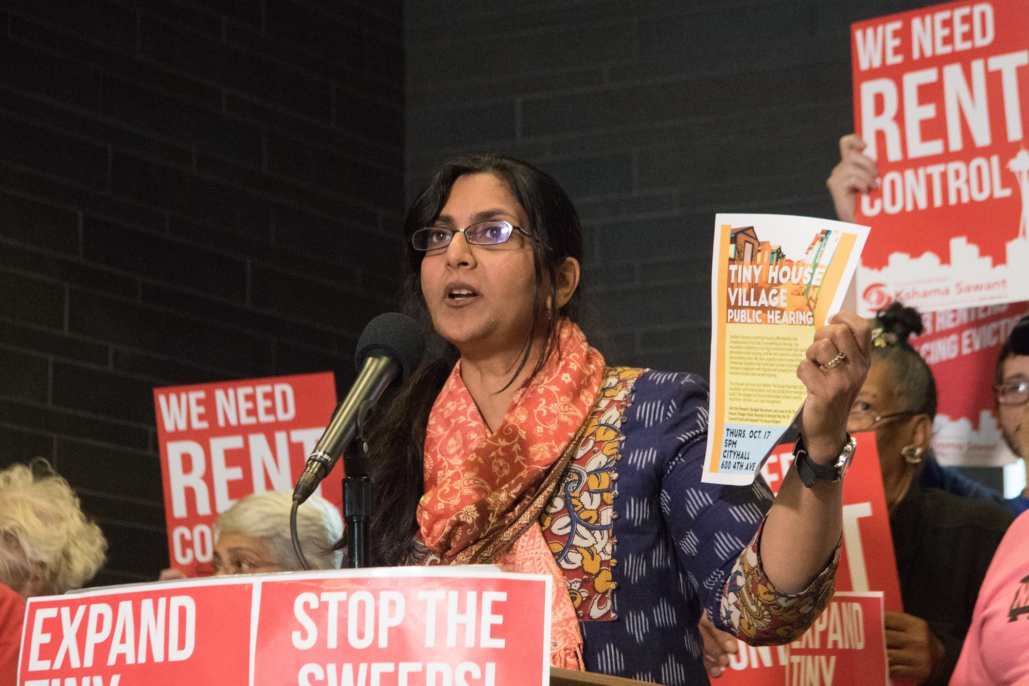
We’ve covered how the 2021 election didn’t go progressives’ way in three key Seattle races, despite a late surge in progressive ballots. But new turnout maps from Jason Weill show that the old pattern of higher turnout in single family areas than in apartment-heavy areas was on steroids this year. And Mayor-Elect Bruce Harrell and new Councilmember Sara Nelson dominated in these high-turnout areas. The negative correlation between neighborhood density and voter turnout only increased in this election, which is not a promising trend for urbanist politics. Greater urban density and voter apathy shouldn’t go hand in hand.
I discussed this pattern with political consultant Crystal Fincher on a recent episode of her Hacks and Wonks podcast. Fincher made the excellent point that our political and economic system tends to reinforce this tendency. Tenants move more often, so campaigns can struggle to locate them to communicate with them and their voter registration is less likely to be up-to-date. Older, wealthier homeowners have more bandwidth to follow politics than do tenants who are barely scraping by; homeowners also benefit from the fact that the bulk of political speech is geared toward mobilizing them. Campaigns aggressively door-knock single family homes and drop literature and distribute yard signs to blanket lower-density areas, while lavishing far less attention on apartment buildings, especially when buildings have a secured entry. So while Seattle has more apartments than single family homes, its elections are largely waged on single-family turf.
Reaching apartment buildings requires more planning than just cutting a door-knocking list and hoping a random volunteer can somehow sweet talk their way inside a locked entry. Progressive campaigns do not appear to have devised a workable strategy, based on my own personal experiences door-knocking, and on a look at these turnout maps.
In Weill’s turnout map color scheme, dark green areas had the highest turnout exceeding 70%, while lighter green areas were a step down, but still above average. Yellow signifies turnout near 50%. Yellow-orange was in the 40s, orange was in the 30s, and red was in the teens and 20s. As illustrated below, turnout standouts include Laurelhurst, Montlake, Madison Park, Madrona, Sunset Hill, Magnolia, and Seward Park. None of these neighborhoods has an Urban Village designation and all are blanketed in single family zoning.
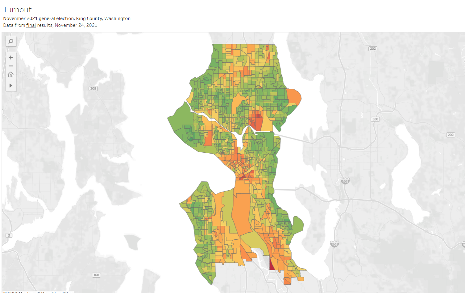
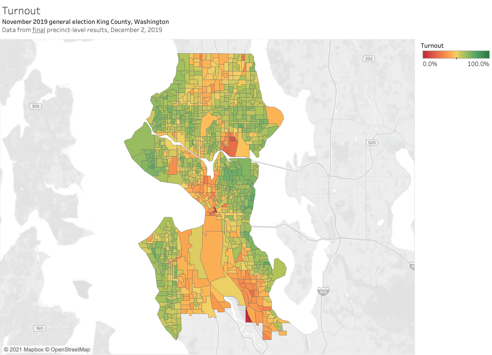
As a whole, Seattle voter turnout was 54.6% in the 2021 election, 49.2% in 2017, 52.5% in 2013, and 55% in 2009, which is the last time progressives prevailed over the Big Business-backed mayor candidate when Mike McGinn defeated T-Mobile executive Joe Mallahan. In 2019, turnout ranged from a low of 47.8% in Council District 2 to a high of 59.4% in District 6.

*
As the 2019 turnout map shows below, the difference between single family zones and the rest of the city wasn’t as pronounced. Particularly in District 3 and 6, more dense areas turned out at single family levels. This helps explain why Kshama Sawant and Dan Strauss won despite massively well-funded campaigns against them. District 7, however, is more of mixed bag. Interbay, Downtown, and South Lake Union still had pretty weak turnout, but Lower Queen Anne was pretty solid. Relatedly, Andrew Lewis’s win was more of a squeaker.
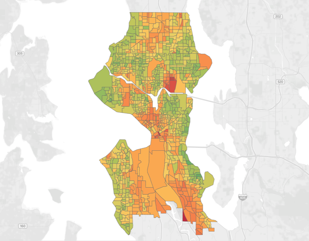
Looking farther back at 2017, when former prosecutor Jenny Durkan beat urbanist Cary Moon by 13 points, turnout was softer across the board. The green bands along the water were a lighter shade, but because the urban core of the city was still largely orange with low turnout, it still equaled out to a rout of the urbanist/progressive mayoral candidate. (See the interactive map here.)
If maps continue to look like they have, progressive urbanists may struggle to win. The challenge is figuring out how to motivate working class apartment dwellers to vote at rates closer to those of people living in mansions. This schism in representation has been a persistent problem in politics; solving it could finally release the gridlock facing our biggest challenges like climate, housing affordability, racial justice, and wealth inequality.
Seattle Progressives Gain 13 Points from Election Night, but Come Up Short
Election Results Maps Show Single Family Surge Propelled Centrists to Victory