A good amount of the work that we do here at The Urbanist involves pointing out where the region’s governance and foresight are lacking. We review a lot of plans and pick them apart pretty hard. Sometimes it’s a disagreement on process. Sometimes it’s a dive into the numbers. Sometimes we’re begging for anyone to have an ounce of vision.
But the bad plans often have a much deeper source. It’s not just that an idea was terrible, it’s that the idea arose when planners misused their tools and education. Such errors really fall into a couple of basic forms. Unfortunately, those forms get repeated a ton.
Errors of statistics – Oversimplifying by averaging complexity.
Jane Jacobs called this one a half century ago. Most people don’t get past the first part of The Death and Life of Great American Cities, enjoying the description of a lively street and the importance of parks and leaving it at that. However, as we’ve covered before, Jacobs saves the most insightful analysis of cities for the very end of the book. Planners combine two tools that shouldn’t be combined, and the output is garbage.
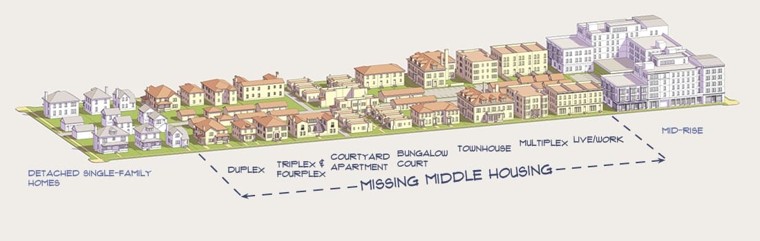
The first tool comes out of the 19th Century Garden City movement which essentially asked “how many houses do you need for a set number of jobs?” It’s a simple math problem with two variables in a relationship with one another. Parks per household. Families per school. Cops per 1,000 people.
The second tool comes from the 20th Century: statistics and Le Corbusier’s Radiant City. The modernist architect relied on averages drawn from huge numbers of examples. To build his perfect city, Le Corbusier developed Modular, an idealized person of 1.83 meters tall. Of course, those averages are meaningless because no individual actually fits them. 99% Invisible did a really good job explaining this. Very few people fit average human proportions, average time commuting to work, or average apple consumption much less hit all of them.
But to Jacobs, the greatest sin is that planners double down on nonsense by using both tools together. We boil down huge statistics to averages, then treat the average like a realistic number. Planner math, to Jacobs, suggests cities are “understandable purely by statistical analysis, predictable by the application of probability mathematics, manageable by conversion into groups of averages.” Planning detached from the real world by squeezing out an average, then dropping it into an abstraction.
Seattle creates meaningless abstract numbers all the time, and the best indicator is when something is a billion dollars. The cruise industry brings Seattle a billion dollars worth of tourism. Homelessness in Seattle costs a billion dollars. These often meaningless abstractions were created through very questionable analysis, but pop as headlines.
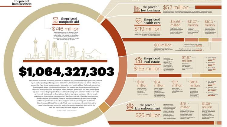
The problem is compounded when the abstraction is then used for really awful math. Each of the 200 cruises in Seattle each year is not bringing in $5 million because the boats are different sizes and serve different people. It is legitimate to complain when some of them are flooding Belltown with exhaust. Each of the 12,000 people experiencing homelessness – sheltered and unsheltered – cannot cost the region $83,000 when the original estimate includes the cost of office supplies or an extrapolation of conventions lost to the perception of crime. Planners fail when these absurdities are left unquestioned and allowed to drive decision making.
Errors of Hierarchy – confusing rank with order
There’s some good reasons to confuse hierarchy and priority, starting with the limits of the language. Both have to do with an order being set by status or importance. But the difference is whether that order comes from outside the group or inside. Priority is set from outside usually based on time, and players are assigned spots. Hierarchy is set from inside the group, identifying an individual and setting out how others relate. Priority is a deli number, hierarchy is a branching tree.
Hierarchy is so fundamental to urban planning that it’s like oxygen. Hierarchies are the frameworks for understanding the relationships between places or concepts or built forms. There’s the hierarchy of roads – freeway, arterial, collector, local. Hierarchy of jurisdictions – villages, towns, cities, metropolises. Regional plans establish hierarchies to target growth and another hierarchy for comprehensive planning implementation. And good luck escaping a planning seminar without someone mentioning Maslow.
But some hierarchies are invisible and awful. In the Euclid v. Ambler Realty decision that established zoning in the United States, the court set single family detached homes at the apex of the hierarchy and called everything else “mere parasites.” The structure of permitted land uses reflects this, with single family having the most protections, then commercial, with industrial lands forbidding homes (protecting them from industrial uses) but allowing almost everything else.
It’s when these hierarchies get unquestioningly baked into priorities that we run into real problems. In the 1930’s, neighborhoods were put in a hierarchy for home loans which set the priority for who would be bulldozed for highways. Puget Sound Regional Council’s Vision 2050 sets a hierarchy of regional growth centers as a priority for transportation funding. That hierarchy is underpinned by municipal zoning ordinances and a solid dose of regional politicking.
Projects get prioritized because of funding and time constraints. A city cannot rebuild every school at once, so there has to be some triage. And there can be a legitimate reason that hierarchy drives priority. Say, an important bridge connecting to a sixth of the city has developed cracks. Repaving the neighborhood road is going to get put on the back burner as the department’s attention turns towards fixing this. Hierarchy – a freeway/arterial over a local street – dictates priority, and everyone is clear about that.
The planning failure is when the hierarchies become more important than the end result. When sticking to this relational framework is allowed to drive decision making without question or observation. Assumed hierarchies are most evident when they gets turned on their head. The pandemic really highlighted one example as essential workers were left underserved by idle transit. Buses and light rail that were built to ferry office workers were not connecting grocery staff and hospital workers with jobs. New priorities to get to work conflicted with the traditional hierarchy that put the commute to downtown at the top.
The lesson is really clarity. Planners error when we fail to ask if this project or program has its place in line because that’s where it belongs, or because of its place in some hierarchy. And did we even agree on this hierarchy to begin with? Are they getting their deli meat first because of the number on the ticket, or some ranking that was created a century ago.
Errors of visualization – the picture isn’t the point
Walk circles are a very useful illustration for locating a transit hub. Put a quarter-mile circle on a map, trying to scoop up the most houses and shops. Find the center of the circle, and that’s the best location for a new train station.
Walk circles are a very good visualization technique, but too often they are allowed to drive the entire discussion of transit location. Maps are redrawn and station locations adjusted so walk circles look better. Don’t make them too circular, that doesn’t reflect how the streets in the area connect. Don’t let them overlap, otherwise the location is considered wasteful and areas overserved. And ignore the surface highways that run through the walk circle because there’s sidewalks.
In the race to build the perfect circle, other metrics like coordinating with expected development are cast aside. Stringing stations together to serve a corridor is ignored. The potential to use transit to overcome topography or stitch together neighborhoods never appears in the discussion. The walk circle becomes the point, instead of making a usable station.
For example, there are noises being made by Sound Transit about combining the two Interbay stations along the future Ballard light rail extension. This would be a destructive undermining of ST3. Combining Smith Cove and Dravus stations ignores the hard divisions that separate the neighborhood in two. It would put a lone station in a valley with no support should it become congested or escalators fail. Focusing all local transfers to a single site would make the station an inaccessible terminal surrounded by highway circulation. And its success would depend on everything going absolutely right with nearby redevelopments, which is deeply uncertain at this point.
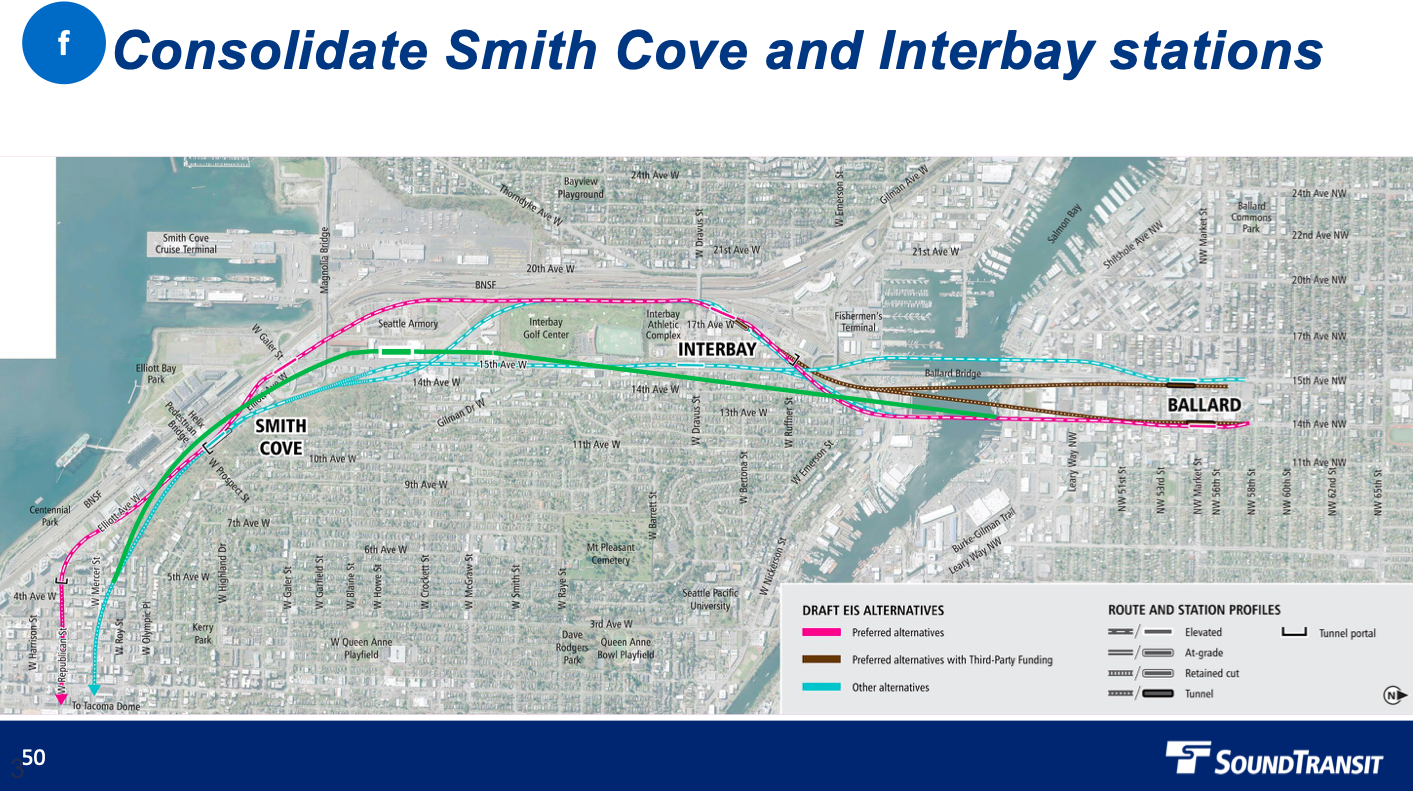
Analysis of just walk circles makes such a change look very inviting. Estimates of ridership loss appear nominal and skipping a station takes tens of millions in costs off the ST3 books.
But we’re not building a walk circle. We’re building stations in a neighborhood. Confusing the two is an error.
And that’s really the theme of basic planner errors. Urbanists can become so infatuated with the analytical toys that the point of the analysis becomes secondary. It’s letting the tools of planning – statistics, hierarchy, visualization – define or even become the end result. These are guides and tools, not the products themselves.
Recognizing that is the first step in avoiding such planning pitfalls. Taking a step back and asking “does this [math, framework, picture] actually make any sense?” is a vital self-check on planning work. Otherwise, we’re left in a world of averages that don’t fit anyone.