Though incorporated as a city after the Civil War, Seattle has a North-South divide. The North is wealthier, whiter, and healthier than the South. North of the Ship Canal, there’s more groceries, more resources at the schools, and fewer pollutants in the air. That division is well discussed and documented.
But it’s not usually consolidated into a single list. So here’s a bunch of resources to back up any talk about Seattle’s demographics. Even documents that are supposed to discuss these issues never get around to putting the same things on one map.
There are scads of city-wide initiatives looming on the horizon. From the Comprehensive Plan to light rail expansion, every document about Seattle should be discussing its segregation. All of these divisions are self-made and self-reinforced. Plans must wrestle with the lingering effects of racial covenants, redlining, and highway building. Once you see these things together, the pattern is very evident.
Map 1: Diversity
The Seattle Civil Rights and Labor History Project at the University of Washington is an excellent resource for mapping the city’s segregation based on race. They provide a century’s worth of data showing the concentration of Black and Asian families in the Central District. This is stable through 1980 when the diverse cluster starts expanding towards the south and eventually over the city line. Now the region hosts seven jurisdictions that are majority-minority including Tukwila, SeaTac, Renton, Kent, and Federal Way.
The project also shows the flip side of racial concentration. In the Racial Restrictive Covenants analysis, researchers show the neighborhoods that excluded people “not a member of the Caucasian or white race, except servants domesticated with an owner or tenant.” They made this AMAZING interactive map embedded below. While the concentrations through Laurelhurst, Maple Leaf, and Blue Ridge are widely known, there are also clusters in Uplands, Mount Baker, and along the border with Burien. We have discussed these subdivisions before, showing the Seattle Times’ long history of profiting from these subdivisions.
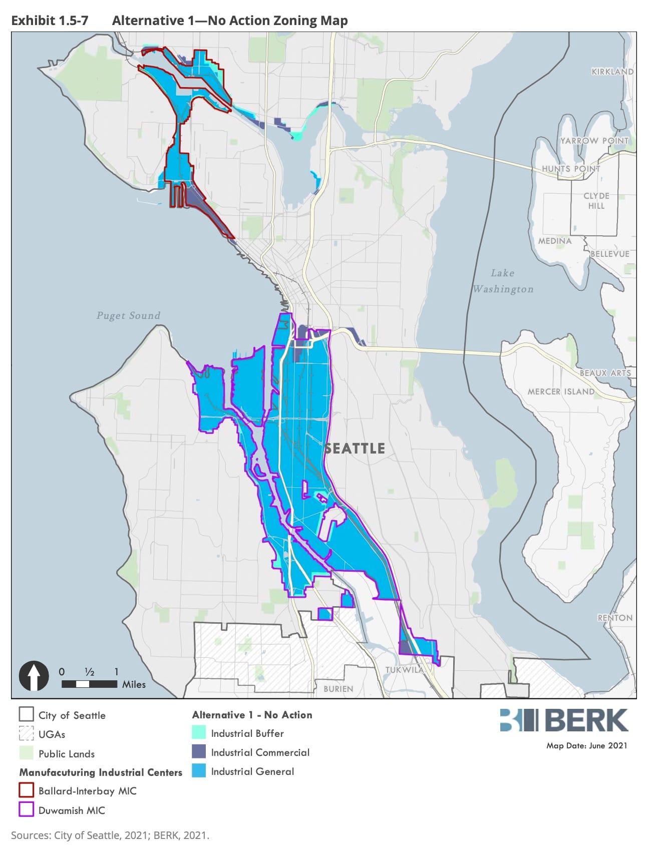
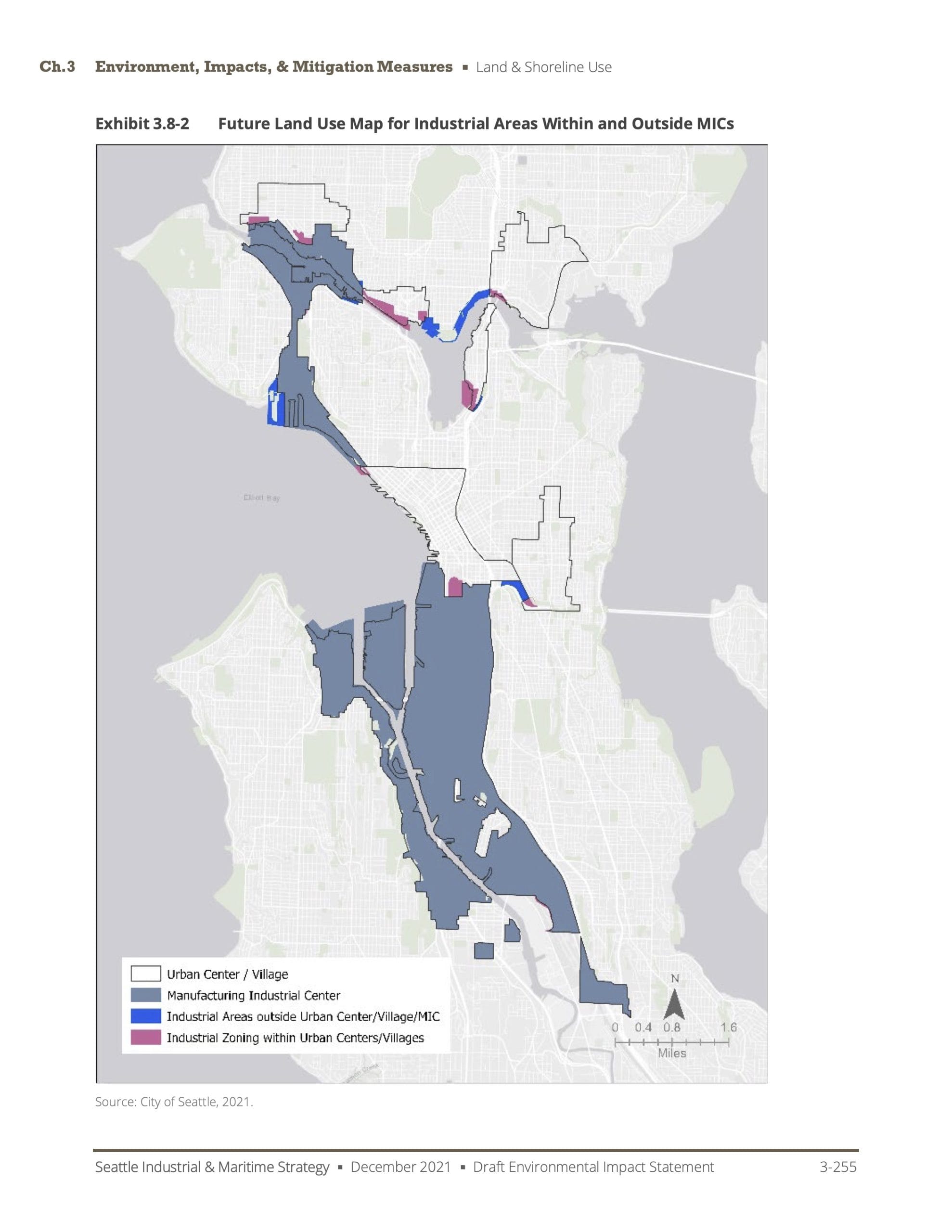
Map 2: Industry
Seattle’s industrial areas are so concentrated to the south that recent city-wide analysis didn’t feel the need to include the ten square miles of city north of 85th Street. Of the city’s 5,142 acres of industrially zoned land, 3,981 are located in the Duwamish south of Downtown. The 1,000 acres or so north of downtown includes grocery stores, breweries, and Gas Works Park.
Industrial lands also highlight a secondary division in the city, the division between detached one-plexes and everything else. A combined map showing Manufacturing Industrial Centers and adjacent Urban Villages, shows how little of the city’s waterfront is accessible to anything except single house lots. Seattle’s densest neighborhoods do not directly touch water, except through industrial lands. Apartments never touch water, only industrial waterfront. Beaches are reserved for Seattle’s estate holders.
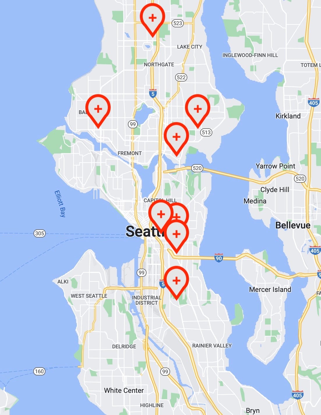
Map 3: Hospitals
Seattle has one hospital south of I-90, and that’s the Veteran’s Administration Hospital off Beacon Avenue. The city’s main cluster of hospitals include Swedish, Virginia Mason, and Harborview, and are all tucked together in the southwest corner of First Hill. North of the Ship Canal are UW Hospital’s main campus and Northwest Center, Swedish Ballard, and Seattle Children’s hospital.
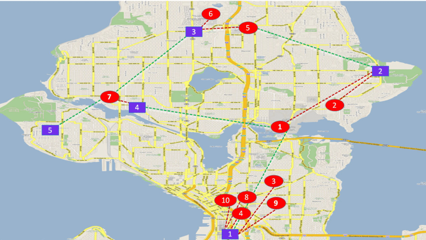
An interesting quirk of hospital location is emergency response in a disaster. A 2018 paper looked at hospitals and resource warehousing in Seattle. They weren’t bothered to include anywhere south of I-90 in their map or discussion. Their model simulates moving medical goods in an emergency, and considers the probability of path or vehicle destruction in the process. The National Guard is already ahead of them, considering access to its current location in Interbay as a liability in a disaster. Hard to get through downtown or Ballard when bridges and tunnels crumble.
Based on the locations of hospitals in Seattle, collapsing highways would cut off all neighborhoods west of I-5 and south of the Ship Canal. That would include West Seattle, Downtown, Queen Anne, and Magnolia. Beacon Hill and Rainier Valley would have just the VA.
Map 4: Health and Pollution
The state has an environmental health disparities map, created as a collaboration between Front and Centered, UW’s Environmental and Occupational Health and Sciences, and Washington’s Departments of Ecology and Health. It shows the convergence of social factors and pollution burdens that create concentrations of burdened neighborhoods statewide. It uses a model that multiplies threat of pollution by the vulnerability of particular communities. Emissions, particulates, and lead risk are calculated against poverty, education, and cardiovascular disease among other criteria to establish who we put in harm’s way.
The answer is poor communities of color. Due to impoverished communities bordering I-5 and various airports, there is a solid band of “HIGH (10)” environmental risk neighborhoods stretching from SeaTac to the stadiums. No census tract north of Downtown hits that risk. Only two North Seattle tracts are level 9 while there are a dozen in the south.
Map 5: Parks
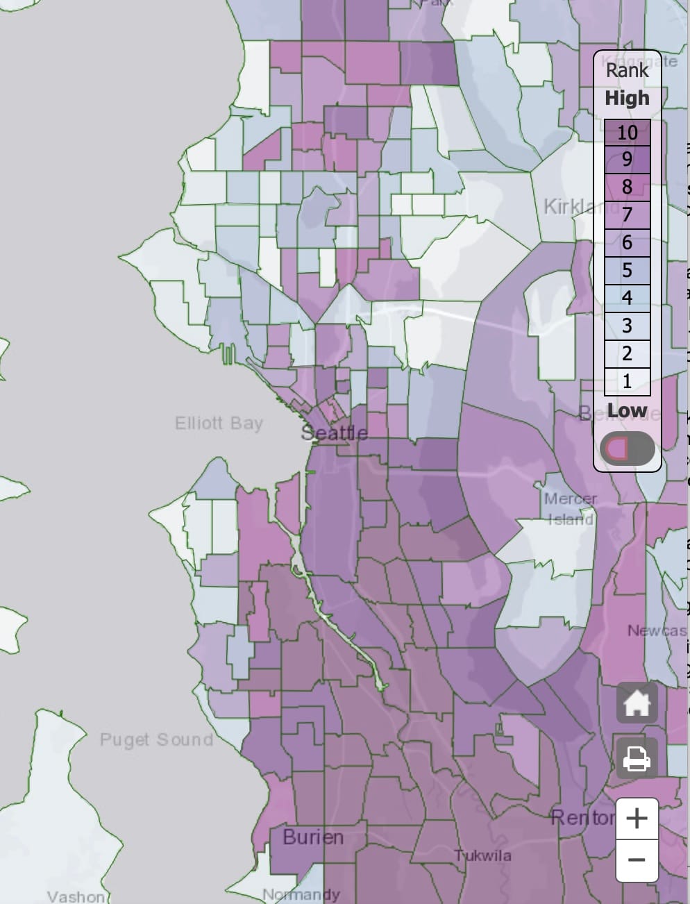
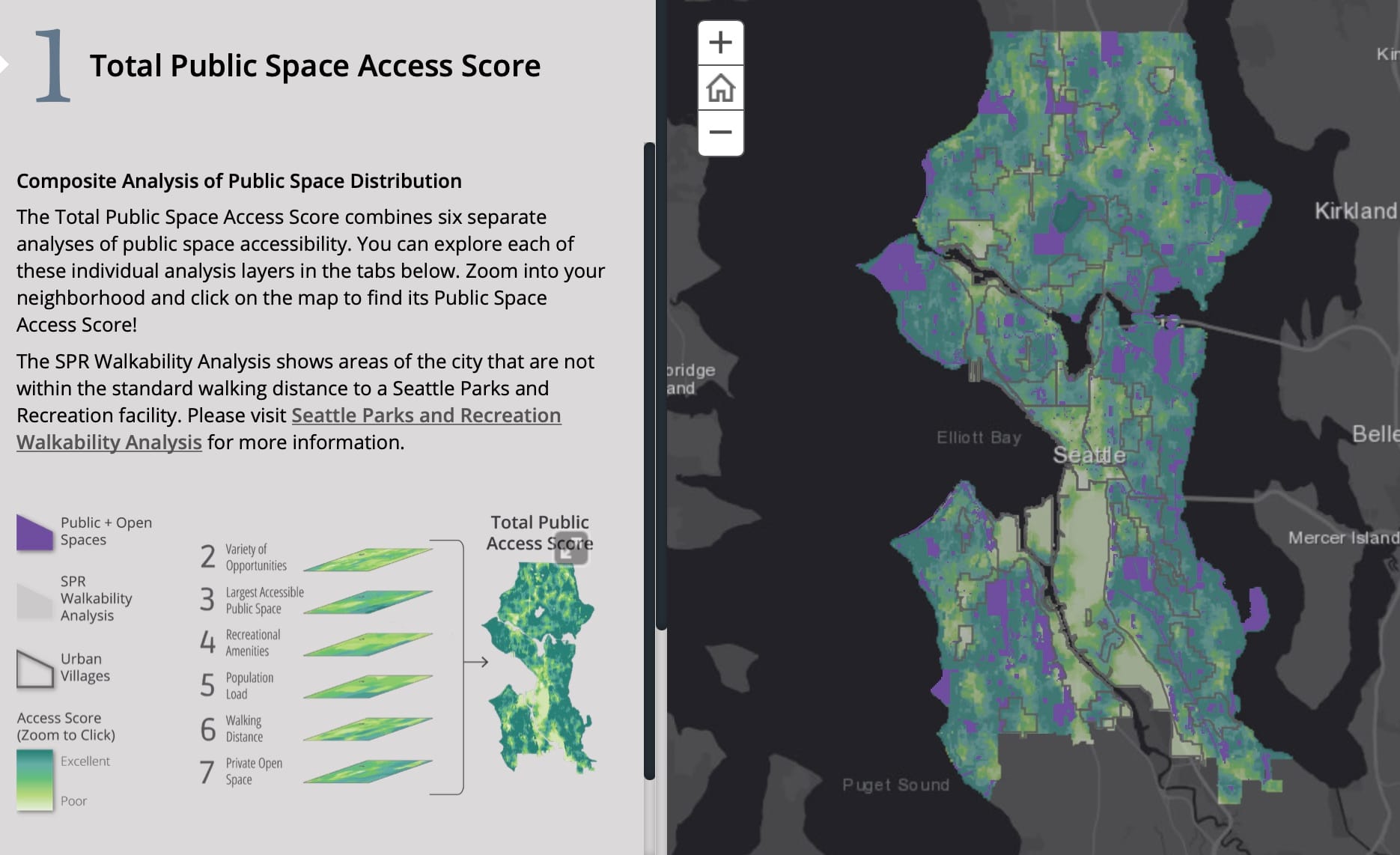
City-wide surveys of greenspace in Seattle show that much of the city is within a 10-minute active route to a park. However, that’s not so comprehensive in the city’s densest neighborhoods. I wish I could actually recommend looking at the Outside Citywide site because it has a ton of information, but it is painfully unstable and hides the most useful bits under layers of “we paid ESRI too much.” The upshot is that the division here is not so much north and south as it is economic where renters are not afforded green public space. (As mentioned above, industrial zones prevent renters access to blue public spaces too.)
Seattle’s densest neighborhoods – Urban Villages – are also the ones furthest from public green space. While some may consider that an argument to de-densify these locations, it would also be possible to improve these numbers by allowing more density near green spaces. Such a change would also be a quick solution to getting a cup of coffee near a park, which isn’t possible through most of the city. The burgeoning neighborhood near Gilman Park in West Woodlawn would be a good place to start.
Over the next few weeks, Seattle’s Parks District will be releasing a funding plan for 2023-2028. The headline issue is the district backing away from a wholly new Green Lake Community Center after they had a year of public consultations to get a design. But the new plan should be examined closely to see how many of these gaps remain unfilled.
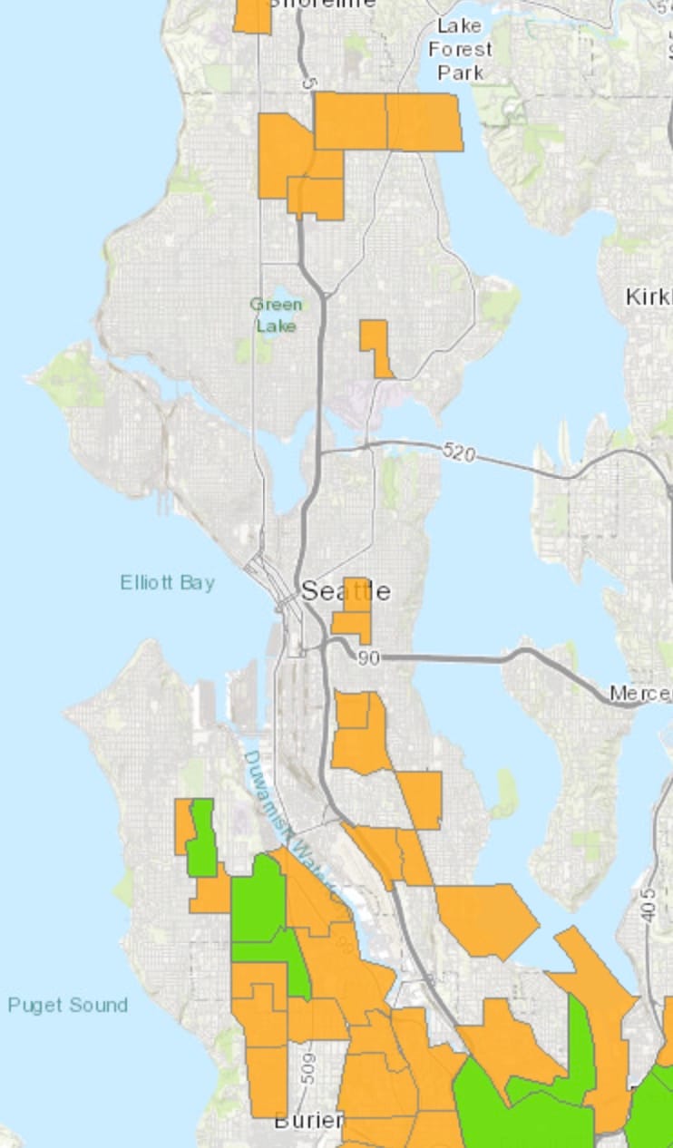
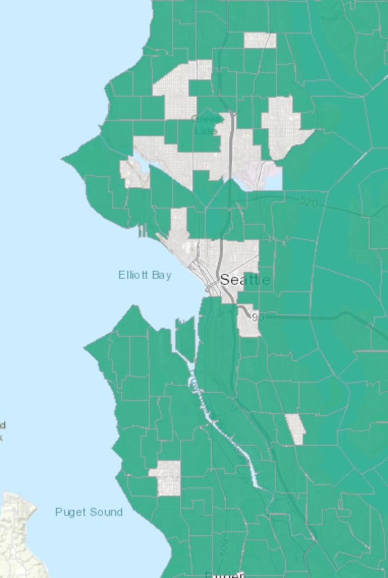
Map 6: Food Desert
The US Department of Agriculture has a Food Access Research Atlas that shows which census tracts are low income and have low access to groceries. Shown in Seattle, this analysis highlights the many parts of South and West Seattle where these statistics overlap. There are also a handful of locations approaching Shoreline.
Interestingly, switching off the “low income” toggle turns the thing unreadable. This illustrates the limit of the analysis focusing on large grocers and census tracts. It appears that very little of Seattle is actually within a half mile distance of a grocery store. It’s really just Ballard, Wallingford, UDistrict and Downtown, wherever there’s residences close enough to industrial zones. These are places that are somewhat saturated with big box grocers and have census tracts small enough for the locations to matter. Only two locations south of I-90 are walkable to groceries, and they’re the Safeways at Othello and Roxhill. Many of these neighborhoods have small food stores, just not evenly spaced close the center of the census tract.
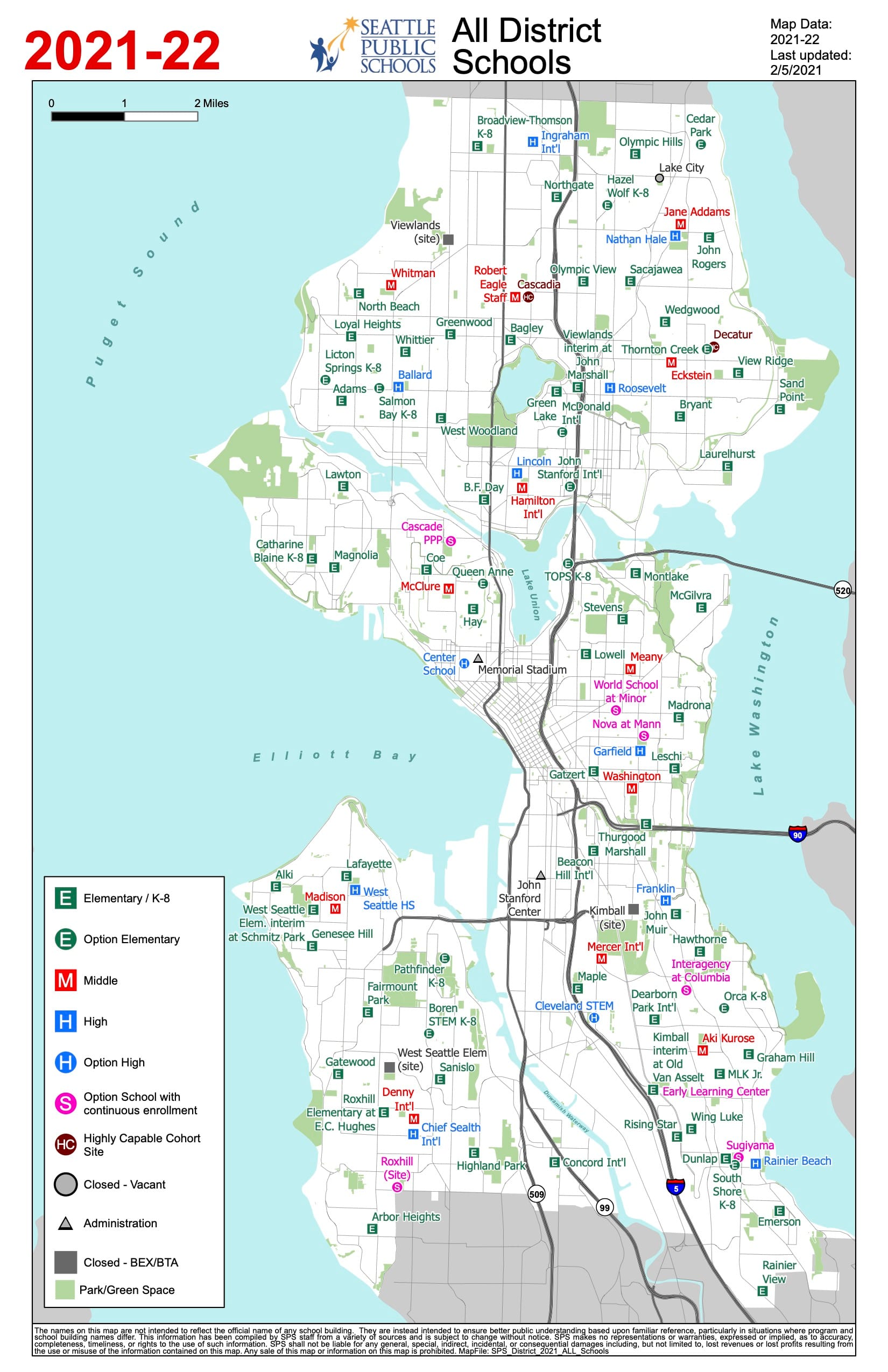
Map 7: Schools
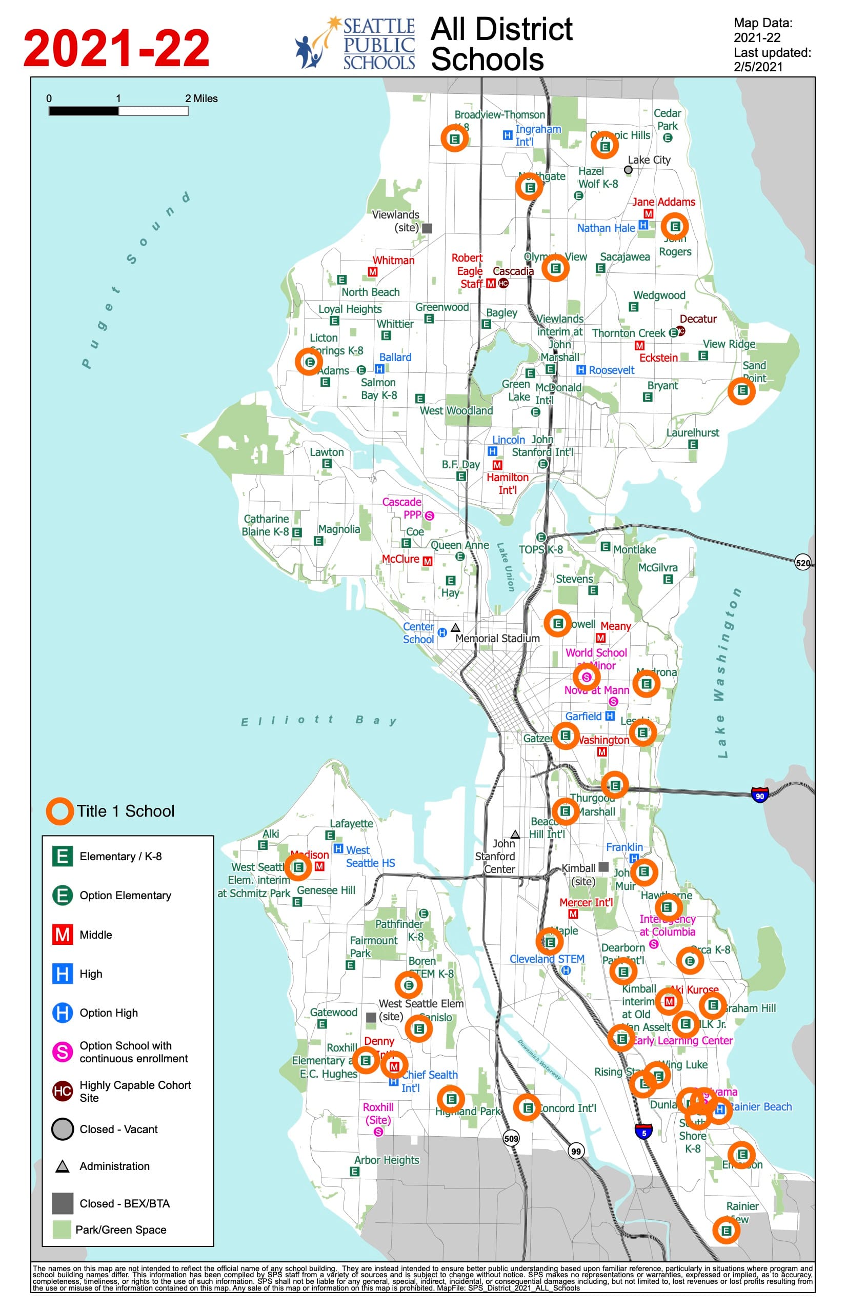
The absolute distribution of public schools in Seattle is fairly even. Cutting the city into thirds with the Ship Canal and I-90 as the dividing lines, there is an even arrangement of schools at all levels throughout the city. The emotional and temporal points in the city furthest from any school are still SPS headquarters and City Hall. The biggest gap is downtown, where the plans for an elementary school have been scrapped and resurrected many times. Magnolia may complain it doesn’t have a high school, but that’s not much of a legit argument until the neighborhood adds enough residential density to pay for it and for the replacement for its beloved car bridge.
| Elem/K-8 | Middle School | High School | Title 1 | |
| North (Ship Canal to North City Line) | 27 | 5 | 5 | 7 |
| Central (I-90 to Ship Canal) | 14 | 3 | 2 | 6 |
| South (South City Line to I-90) | 28 | 4 | 4 | 25 |
Number of schools in regions of Seattle.
However, these schools are creatures of their neighborhoods. In 2007, SPS lost the PICS v. Seattle Schools case in the US Supreme Court. That ruling struck down the district’s use of race as a tiebreaker in choosing schools. Though other respondents in the case revised their busing plans, Seattle never did. Thus we are left with a map of Title 1 schools in Seattle that is heavily weighted South. Schools receive federal dollars for tutoring and supplemental education based designated Title 1. No middle or high school north of I-90 qualifies as a Title 1 school.