We are a carbon-based society. Our daily lives are built around our ability to acquire and consume goods, produce things, move freely from one place to another, and maintain comfortable environments. And for the most part, these daily activities require energy, often carbon-intensive, to make them happen. But just how do we expend carbon? And what does that look like from one place to another? A set of researchers from the University of Berkeley sought to answer these questions.
The researchers compiled data from national household surveys to develop “econometric models” that simulate local household carbon footprints (HFCs). The econometric models are able to break data down at various levels ranging from zipcodes to metropolitan areas. And uniquely, they split data into key carbon footprint categories, including: transportation, housing, food, goods, and services.
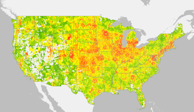
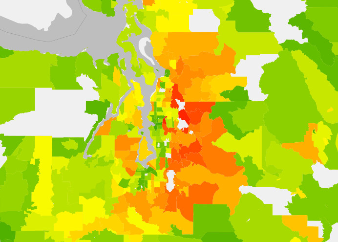
The data convincingly shows that HCFs are consistently lower at the heart of major cities across the United States while their surrounding suburbs have considerably higher HCFs. Researchers suggest that suburbs contribute an astounding share of the nation’s total HCFs, 50% by their measure. But they note that despite the positive correlation of HCFs to population density, it’s a weak one.
Smaller metropolitan areas often outperform larger metropolitan areas with lower average HCFs, despite lower core population densities. Researchers found that this stems from the overall extent of suburbanization in major metropolitan areas. Again and again, major metropolitan areas have far-reaching suburbs that surround the urban core. So while they may have very low HCFs toward the core, their suburbs increasingly counter, and ultimately result in a higher metropolitan HCF.
Intuitively, this makes sense.
Pick any major city in the United States and you’ll see a similar pattern of development and population distribution. The regional core tends to be densely populate with an extreme abundance of jobs. Population densities drop precipitously moving beyond the core, but the demand for access to the core is still relatively high. Unlike those who live near the core, access becomes more of a challenge, regardless of whether that is for jobs, services, or goods. Travel for all of those is therefore more intensive. The core density eventually plateaus while demand beyond remains extensive as vitality increases at the core. Additionally, these major metropolitan areas also tend to have secondary cores that also create their own pull from even further beyond.
But let’s take this back to a local scale and look at Seattle. How do we fare?
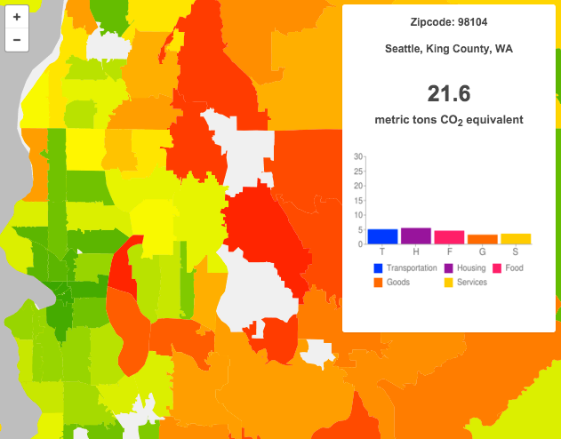
Seattle neighborhoods range1 from as low as 21.6 annual metric tons of carbon emissions per household to as high as 47.4 annual metric tons per household. The citywide average is about 38.2 annual metric tons of carbon emissions per household.
The 98104 zipcode (First Hill, Pioneer Square, Yesler Terrace and International District) has the distinction of being the regions’s greenest district. Residents there expend almost as many carbon emissions on procuring food as they do on transportation, a data point not replicated anywhere else in the region. Further, the zipcode spends 5 or fewer annual metric tons per household on four out of the five key metrics.
Regionally, Seattle stands out clearly for its low household carbon emissions. But other areas in Tacoma, Everett, Bellevue, and Southwest King County have low HCFs as well. Particularly noticeable is a nearly continuous green spine running along I-5, suggesting that annual household carbon emissions are 45 HCFs or fewer in the zipcodes.
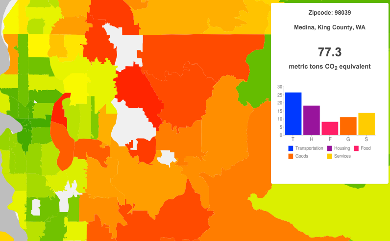
Yet, Southeast King County and the eastern suburban fringes strongly tell a different story. Those areas range anywhere from the mid 50s to the low 70s for annual household carbon emissions. Wealthy cities like Mercer Island and Medina exhibit very high HCFs; 62.7 and 77.3, respectively. Medina has the highest in region.
Looking at the overall trends in the region, almost universally households zipcodes expend the most carbon emissions as follows (ranked from most to least):
- Transportation
- Housing
- Services
- Food
- Goods
Typically, only the wealthiest places see goods beat out food (e.g., Mercer Island and Medina) while the poorest expend more carbon emissions on food than goods and services (e.g., Southeast Seattle and Southwest King County cities).
What other trends and observations can you make from the data?
- The 98177 zipcode was excluded from these statistics due to a majority of the zipcode lying within the corporate boundaries of Shoreline.