Transit App rolled out some updates recently. A few weeks ago, Transit App deployed real-time arrival information for Community Transit-operated routes. This means popular local and commuter routes in the system will show next arrivals wherever available.
The update helped bring all Sound Transit bus routes into having real-time arrival data since Community Transit’s contractor, First Transit, operates routes of Snohomish County origin. OneBusAway and Google Maps have yet to integrate real-time arrival data from Community Transit. Also notable, only Sounder commuter rail and Kitsap Transit services remain without real-time arrival data for third party apps—the latter choosing to keep their data locked down.
Around the same time new real-time arrival information for Community Transit rolled out, Transit App improved their zoom out function to show all rail-based transit and bus rapid transit routes in the Central Puget Sound. That means both Community Transit Swift lines and all current King County Metro RapidRide lines are shown alongside Link, Sounder, and the Seattle and Tacoma streetcar lines. This makes it easy for riders to know where high quality rapid and frequent transit is at a glance.
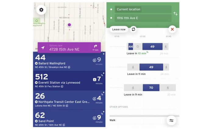
Transit App users may also now find it easier to tell if their bus or train is sharing real-time arrival information, due to last week’s update. When data is live, the estimated arrival times will appear lit up in addition to displaying a pulsing icon; scheduled arrival times will be grayed out. This appears differently based upon screen.
The “nearby” mode is very simple, as the following example shows. Route 44 lacks real-time arrival information since it lacks the pulsing icon and strong white text while Routes 512, 26, and 62 all display live data.

Tapping on a specific route allows users to see upcoming trips, including scheduled and live trips on the way. Route 26, as shown below, is a good example of this where the next two trips are shown with live data. Again, this is represented by the strong blue text and pulsing icon while the next trip in 55 minutes is greyed out, an indication that it is just scheduled trip data, not live. It is also possible to see all upcoming trips by tapping on the “see full schedule” option. This will reveal those trips and show which are currently providing live data.

Using the tripping planning function, it is possible to tell if possible trip pairs are based upon scheduled or real-time arrival trip data. Live trip pairs are shown with green text and the pulsing icon on when the next trip will arrive. Trip pairs with only scheduled trip arrival data are show. with normal gray text.

Using the trip planner function, tapping on a live trip pair option will reveal more information about the option. Each leg of the trip will specifically show if the leg is providing real-time arrival data. In the example below, the trip pair for Routes 44 and 49 only has the first leg with real-time arrival data. This is presumably because the connection to Route 49 is near the start of its route and the connection time would be several minutes between the trip legs, not because Route 49 might delayed or not coming. The trip planner will show all legs with real-time arrival data that have it, making estimates for connections realistic.

These changes should make it better for users to know which options are best for them and plan accordingly, even adjusting trip choices on the fly.
Stephen is a professional urban planner in Puget Sound with a passion for sustainable, livable, and diverse cities. He is especially interested in how policies, regulations, and programs can promote positive outcomes for communities. With stints in great cities like Bellingham and Cork, Stephen currently lives in Seattle. He primarily covers land use and transportation issues and has been with The Urbanist since 2014.


