A lot of transit buzz in the Northwest recently has been about our regional light rail system, Line 1 and Line 2, being expanded and built out. It is an incredible undertaking, with the potential to unify the entire region and make it easier to skip sitting traffic on I-5. By 2024, multiple light rail lines will connect Redmond, Shoreline, Lynnwood, Downtown Seattle, Bellevue, Mercer Island and Federal Way.
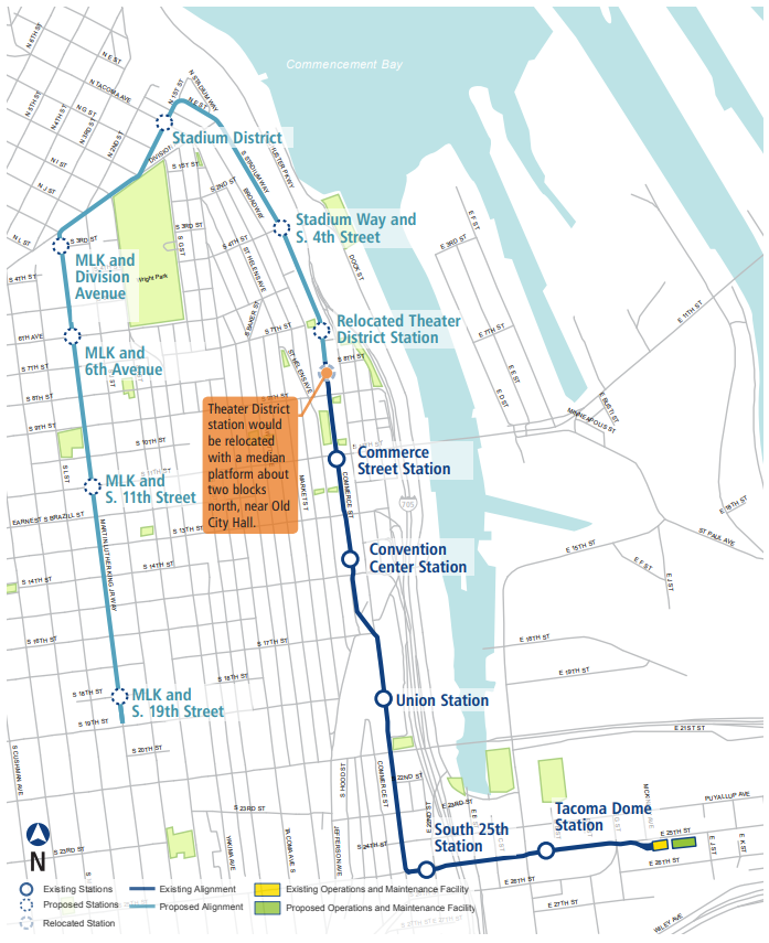
There has been a lot less buzz around the expansion of Tacoma’s light rail line, Line T. Though much smaller, about 1.6 miles compared to the dozens of miles of Line 1, the potential impacts of the 2.4-mile expansion are immense for the people of Tacoma. Line T is set to more than double in length and in number of stations, vastly improving the walkability of Downtown and access to the rest of Sound Transit’s network.
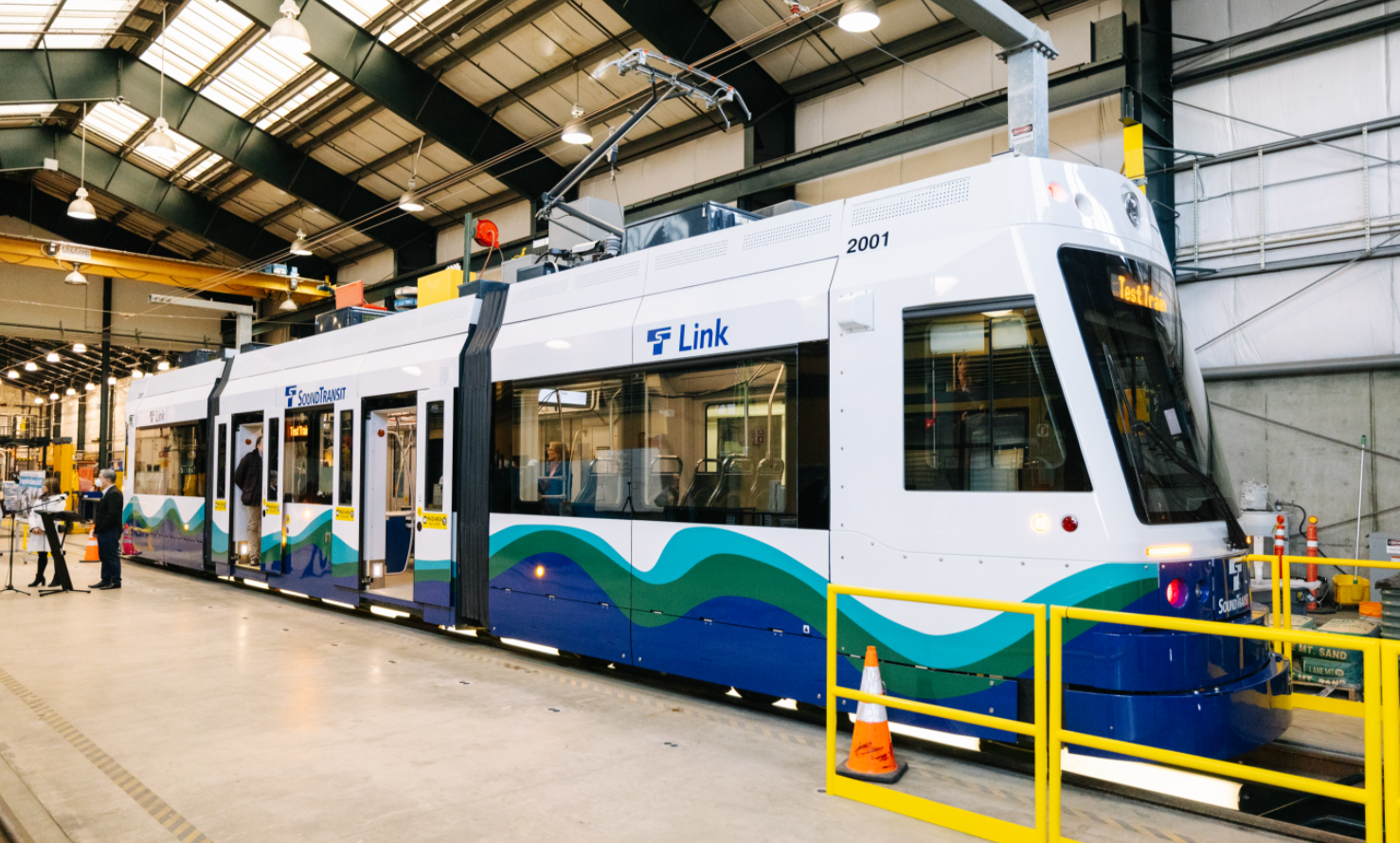
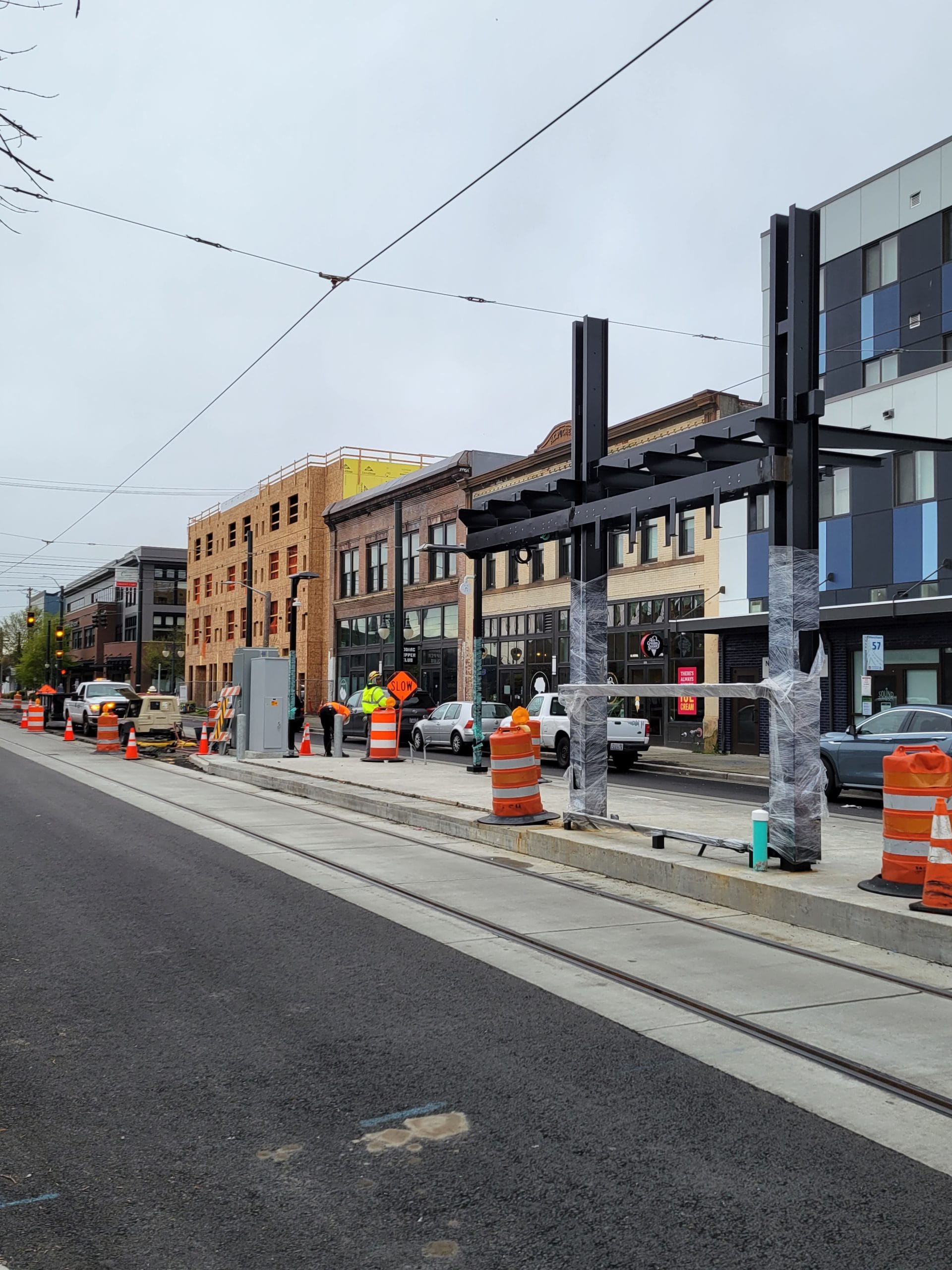
Back in February, Stephen Fesler reported on supply chain issues causing delays in the project, requiring the opening date be pushed back to 2023 with an additional $30 million in funding. By April, it looked like at least of some the supply chain issues were overcome, as the first of a new fleet of streetcars was delivered to begin testing and certification on the existing tracks. As of writing this article, the new stations are in various stages of construction, with some looking near complete with plastic wrap covering the structures and others being actively worked on by construction crews.

While the increase is only a few miles, doubling the length of any transit line is no small undertaking. Six new stations will be added to the existing line to connect the transit center at Tacoma Dome to the Hilltop neighborhood through Downtown. Service is expected to run every 10 minutes between stations at most times of day, minimizing wait times for riders.
But how much will Tacoma’s transit landscape be impacted? What are some ways this could change the fabric of Tacoma’s Downtown and improve the lives of residents? With GIS mapping, let’s find out!

Frequent service is nice and all, but that only really matters to those that are able to access it. Something to consider is that Line T is meant for people who walk or bike to the station, so not every station will necessarily have dedicated parking available nearby. Thus, we need to consider what populations and services are within walking distance of each station to show one measure of how the Line T expansion will impact locals. This is called the walkshed, the area (and therefore the number of businesses and homes) accessible from each station.
There are two ways I know of to look at walksheds, as the crow flies and with a Network Analysis Layer using GIS software. “As the crow flies” means a straight line distance from a given point that creates a circle area, while a Network Analysis Layer is a special type of map layer that integrates the road network to calculate travel times and distances. Think of it as a custom Google Maps. There are multiple types of Network Analysis Layer. We’ll be looking at the Service Area type, which calculates the accessibility of specific locations.
In my research, I have found sources that state that a good assumption for walking distance/time is about 10 minutes, or about half a mile walking in a straight line. I think that is a reasonable time and distance to walk in order to get to a job or access some business or service. Though bear in mind this is a broad generalization. Everyone has different physical capabilities and a half-mile walk could take 20 or 30 minutes for some, or five minutes for others. With that in mind, I’ll mainly be using distance to build out the walksheds.
Let’s do as the crow flies first!
What’s in a walkshed?
Go back to the top of this article and look at the Tacoma Link Extension map again. Familiarize yourself with which stations are existing or new alongside the general shape of the light rail line. This will be important in orienting yourself on the following maps!
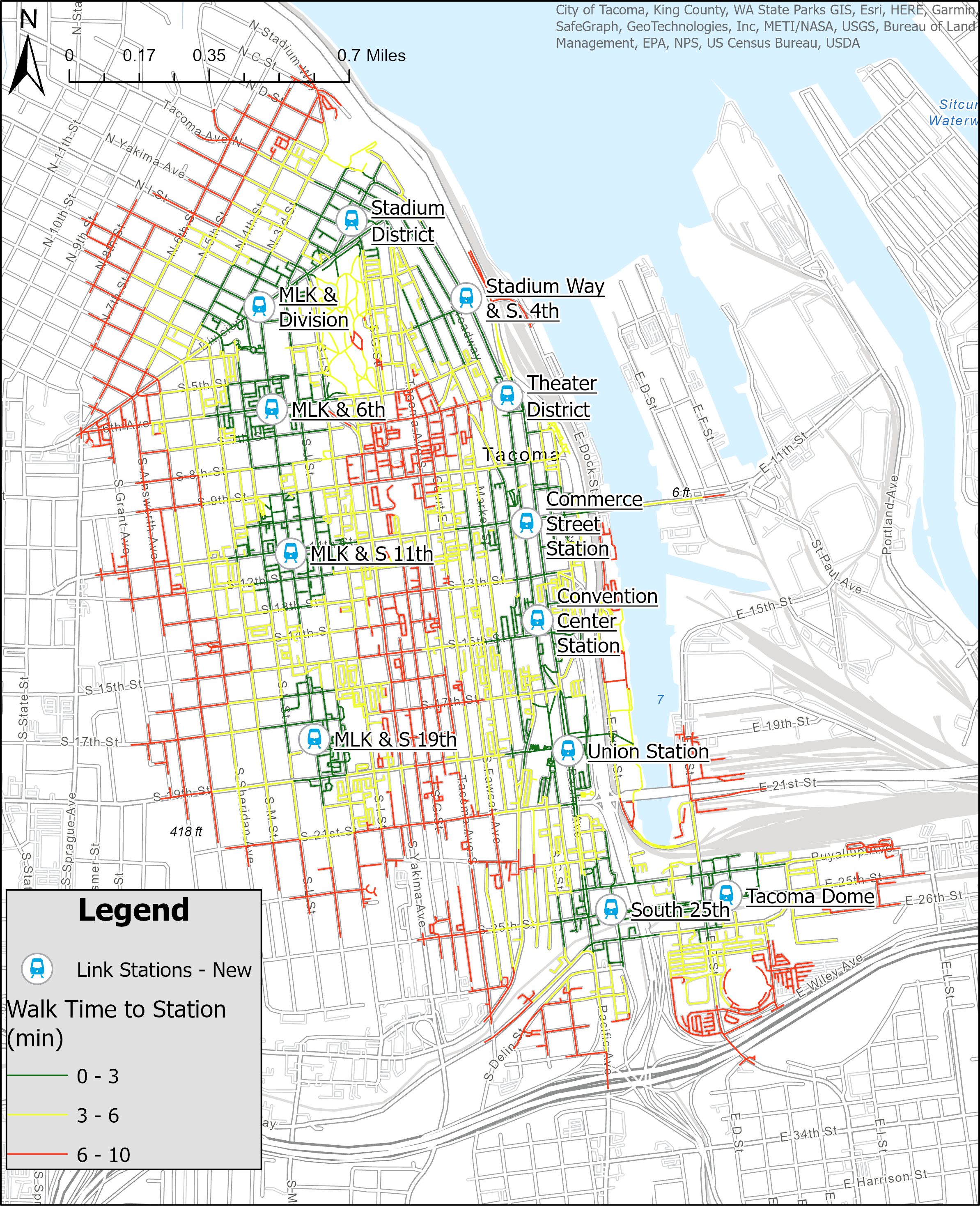
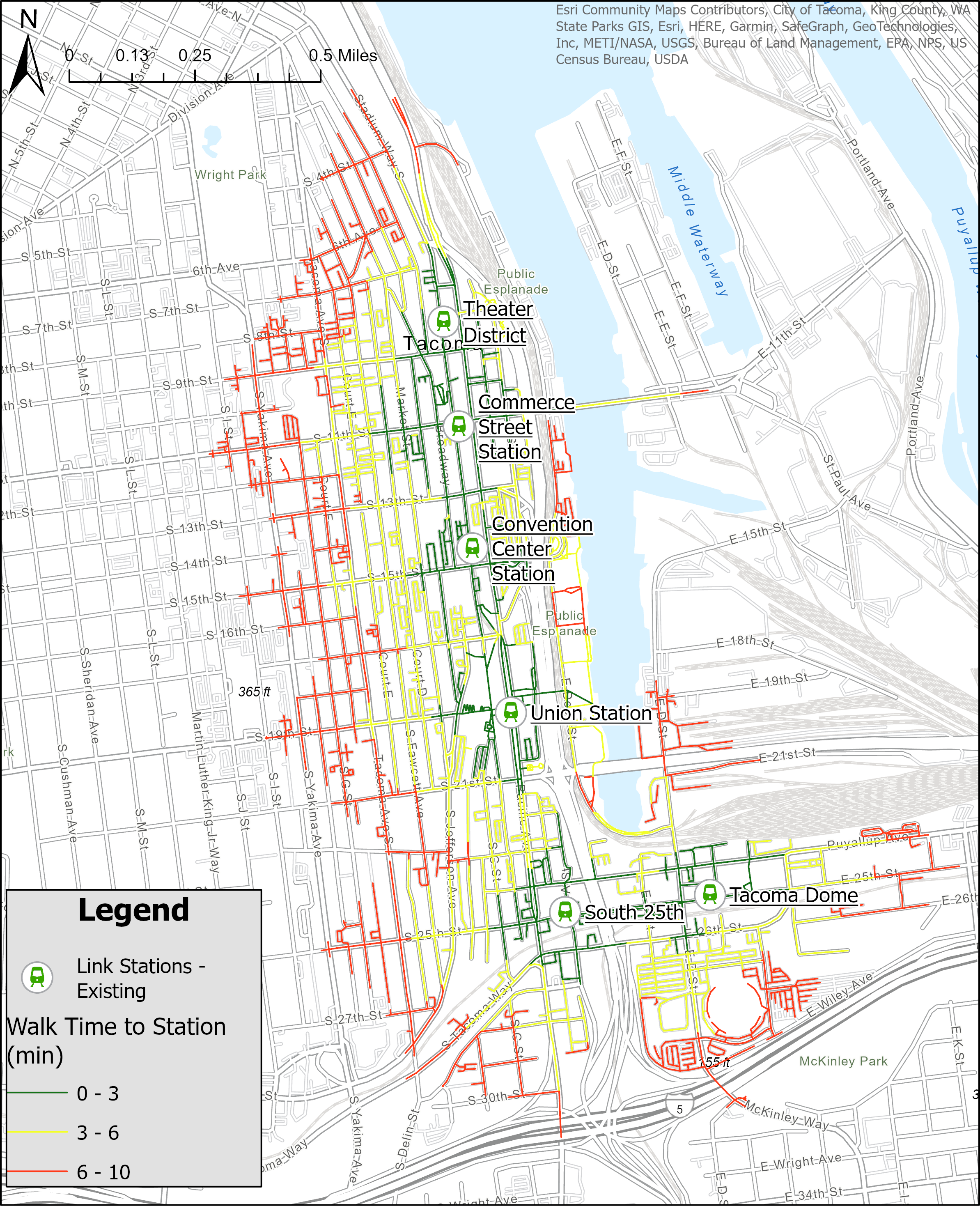
First up is looking at the straight line distance from each station. What I did was create a series of circles from each station representing 0.1, 0.25 and 0.5 miles.
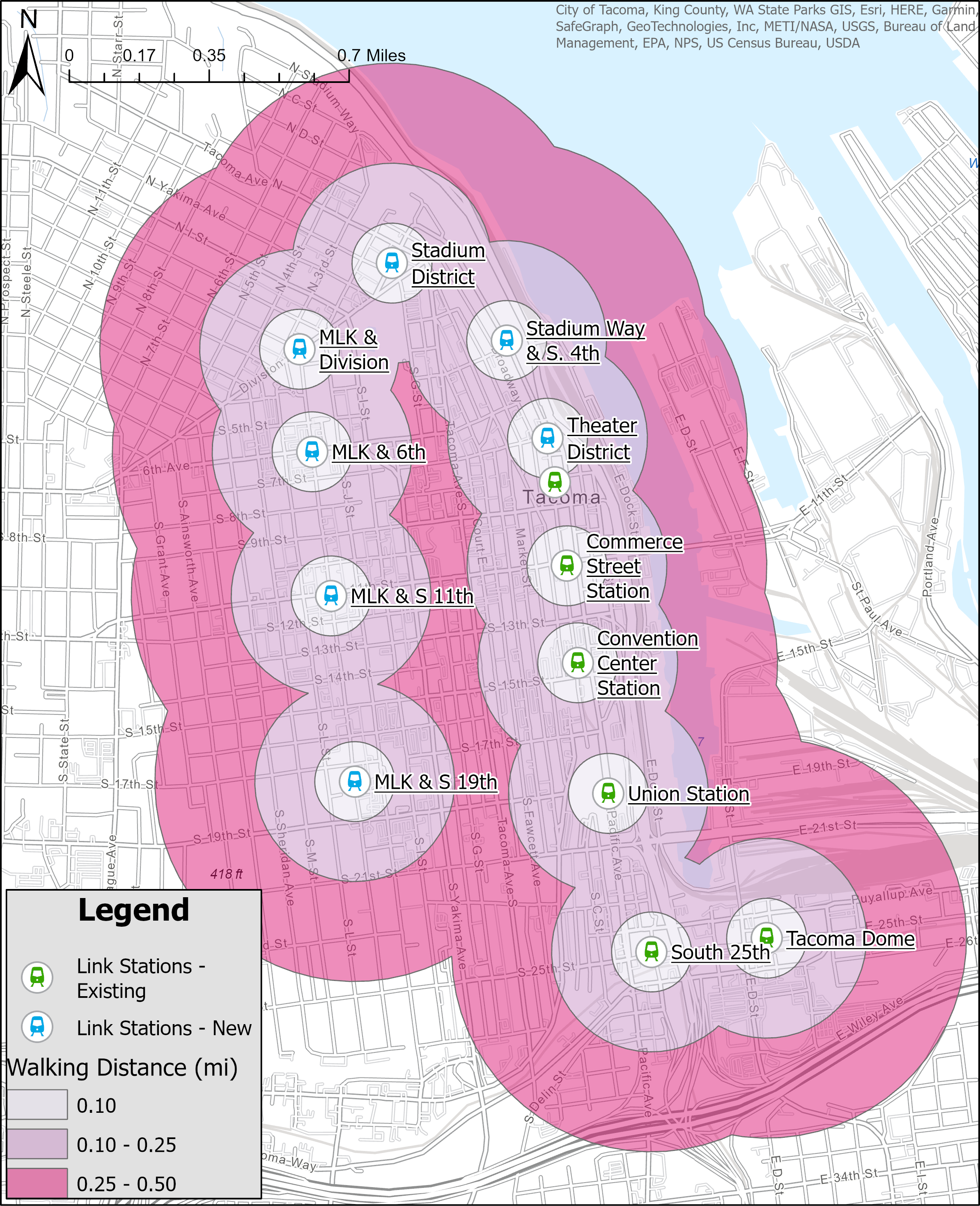
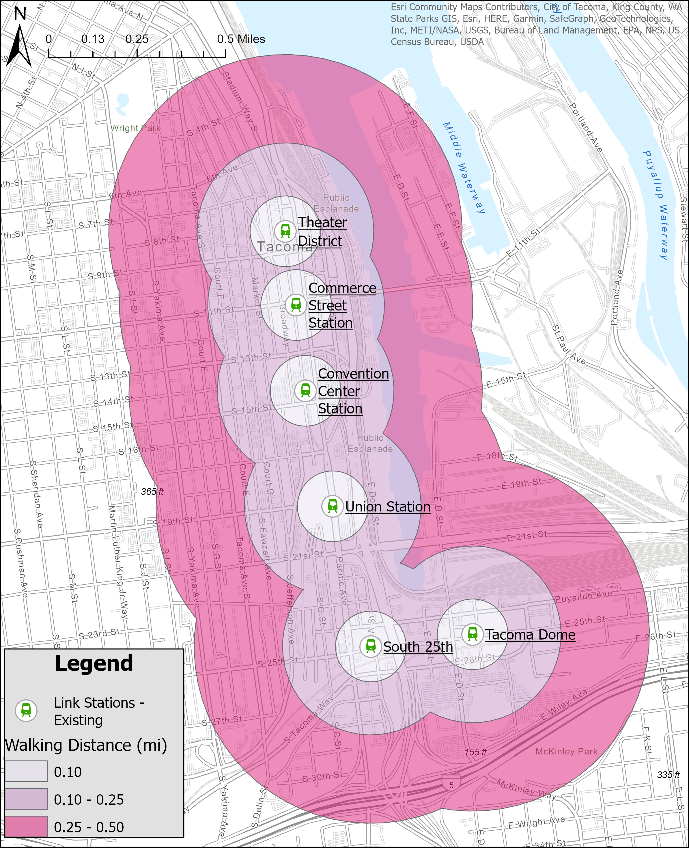
Right away, we can see how much larger of an area is covered by the extended network than the original. In the original, we can see that the reach is limited to Downtown. On top of that, many of the areas within a quarter mile of the existing stations are commercial and industrial areas, which are often destinations. There are multiple residential neighborhoods in that quarter to half mile distance to the west of the stations, meaning people must walk past destinations to access the network. Further, the likelihood of a resident utilizing a transit network is partially dependent on distance, creating a barrier of use if the stations are poorly placed or not extensive enough.In the extended map, we can see that the new stations double the coverage, extending into residential areas along Martin Luther King Jr. Way. These new stations also include ones near Tacoma General and St. Joseph’s Hospitals, allowing Downtown, Stadium and Hilltop residents unprecedented access to healthcare services.Now these maps are great and all, but they are still deficient. These walksheds are “as the bird flies.” I don’t know if you know this, but humans cannot fly on our own (not yet anyways!). These maps are good for exploration and getting a broad overview of the situation and patterns, but we must dig deeper to really assess the new stations’ impact on walkability and connectivity!As mentioned above, the Network Analysis layer includes the road network because that’s what we use to get around! Whether by foot or vehicle, most human travel occurs along the road network connecting all of our front doors. Check out the service areas I created for the old and new T Line networks below:I followed the same logic as the straight line distance analysis, creating cut off distances at 0.1, 0.25 and 0.50 miles. The resulting maps display these distances as walk times rather than distance. These times assume a walking speed of about 0.62 miles per hour (1 kilometer per hour), much slower than the average walking speed of 3-4 miles per hour. Thus, this is a very conservative analysis and the full reach of the expanded network may be a tad larger. Broadly, 0-3 minute walking time represents about 0.1 miles in distance, 3-6 minutes about 0.25 miles and 6-10 about 0.5 miles. Regardless, these service areas are very insightful as we can see the paths people may take and the specific streets that may be just out of reach of the station walksheds. Like with the straight line analysis above, we can see the original network was a primarily Downtown network, serving those residents and connecting them to those businesses and services.Looking at the expanded map, we can see a huge growth of coverage. Basically, wherever you see colored lines is no more than a 10 minute casual stroll from the nearest streetcar platform. That’s pretty incredible! This extensive coverage allows unprecedented access to Downtown, allowing residents from neighborhoods outside of Downtown to more easily patronize those businesses and services and vice versa.

What if just one person in every household covered in this walkshed switched to using the T Line for the majority of their travel? Think about how many cars we could take off the road to ease congestion and how much those households could save on gas and insurance expenses? Someone could get from 6th Avenue to the Tacoma Dome, then up to Seattle for a few dollars in probably an hour or less! While this is all possible now, in a short time many more people will be able to do it easily!
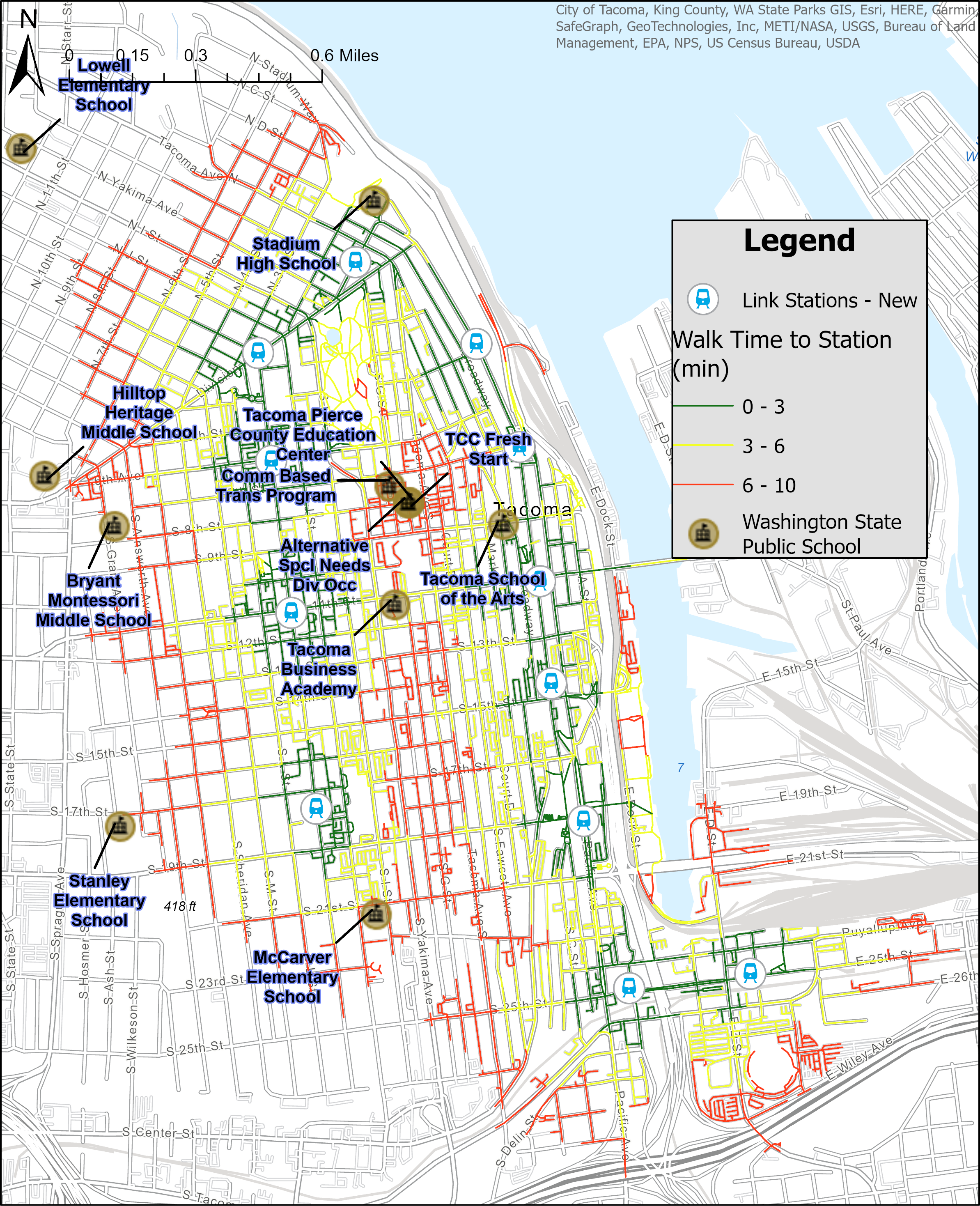
Not everyone using the T Line will be using it to get to work or to go shopping. Access to education is a critical component in uplifting children out of poverty and providing structures like after school programs to keep them mentally and physically active. As you can see in the above map, there are nine public schools of different types that fall within or just outside the station walksheds. In addition, UW Tacoma and a number of child care services fall in this area as well.
The T Line puts all of these schools within closer reach for many households with students, about 5-10 minutes from the closest station. This is especially important for households that may not have drivers available or where bussing is not an option. With the expected frequent service, this makes the expanded streetcar line an extremely viable way for students and their families to get around.
Currently the T Line is free to use, but with the opening of the Hilltop extension, fares are scheduled to be implemented. Fortunately, the planned $1.50 fare will still be a low barrier of entry for riders compared to other transit fares, programs like the Youth Summer Pass will allow for students or low income residents to access the T Line for a flat, discounted rate.
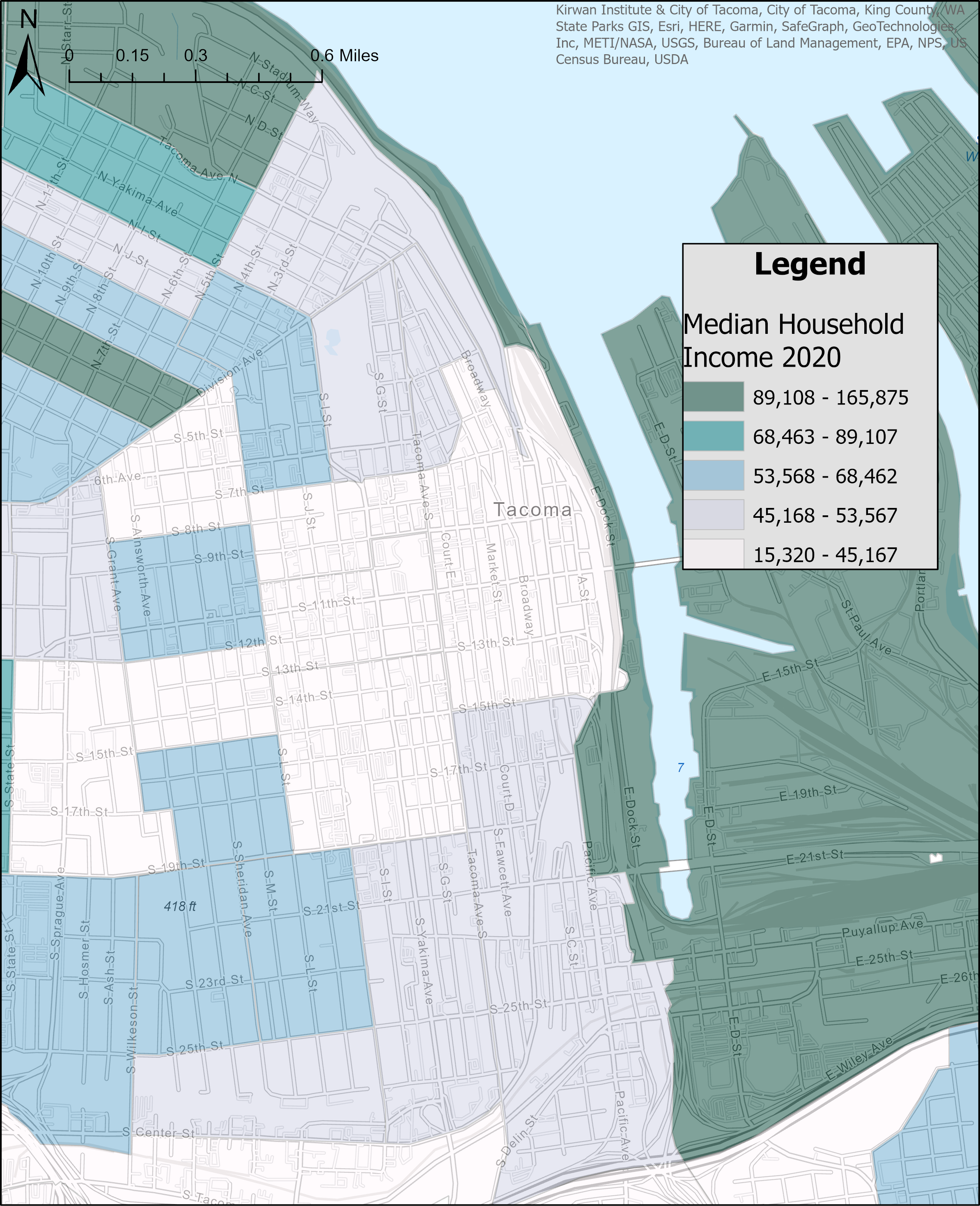
Before looking at the last set of maps, I wanted to introduce the Median Household Income (MHI). Income is often used in urban planning to help allocate services and resources. When combined with spatial data, it can become a strong economic indicator for a given area. This data I’m using is one component of the Equity Index, which I have discussed in previous analyses. It basically combines over 20 socio-economic indicators to score the level of equity in different parts of the city.
Looking at the map, we can see that Downtown is mostly composed of people from the lower three income tiers except for the industrial areas and waterway luxury apartments. It is good to know that not only was frequent and free transit service already established for part of this lower income population, but that it is being expanded to spread that positive impact further.
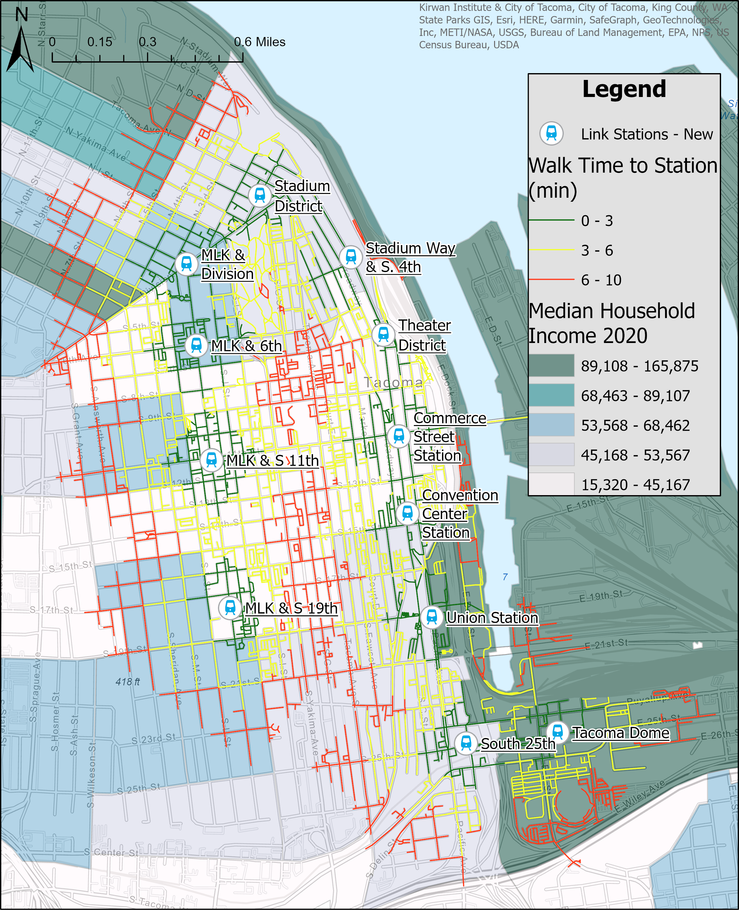
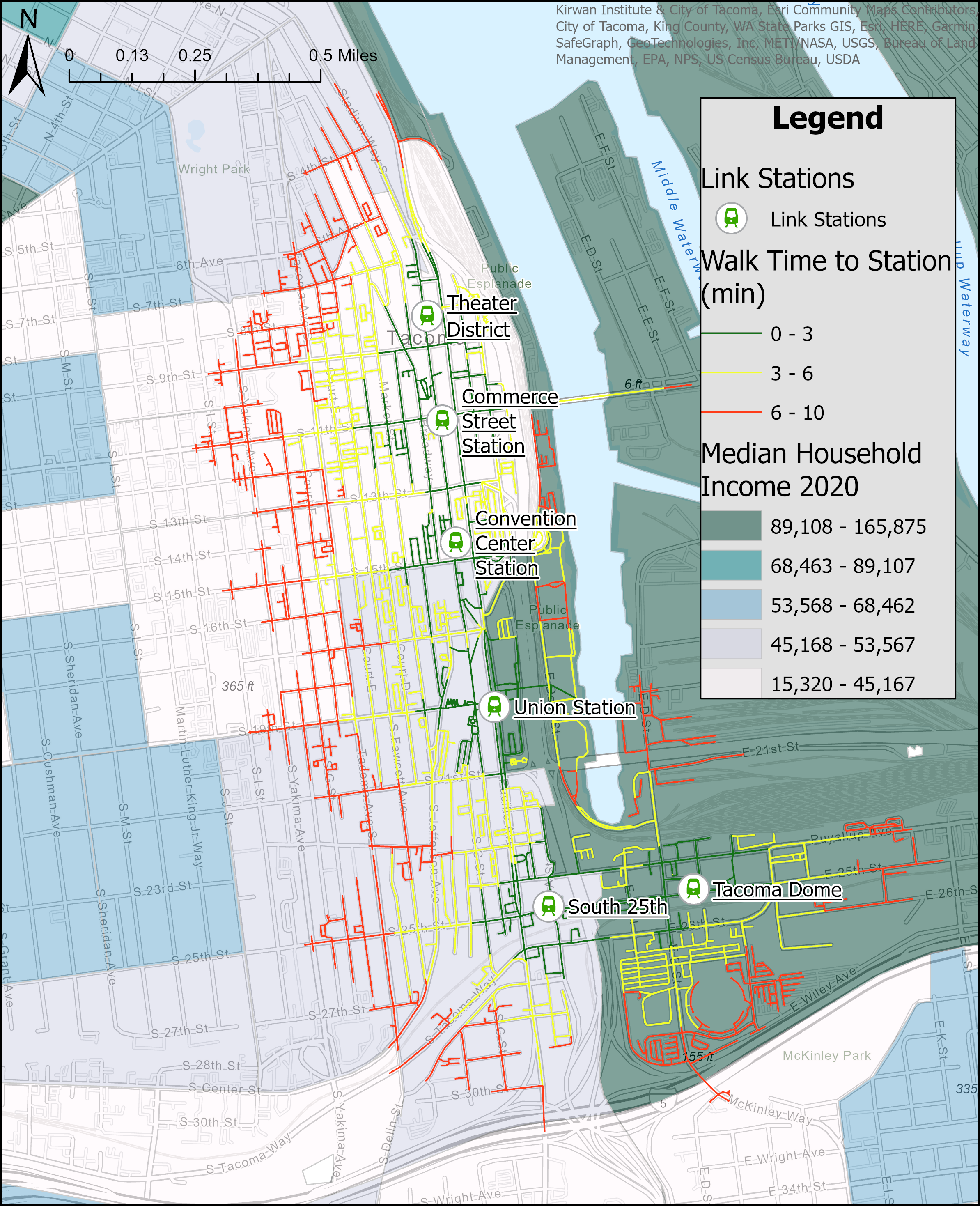
In comparing the two sets of service areas in the context of MHI, we can easily see the shortcomings of the original system. It mainly occurred along the easten edge of less wealthy areas, in the middle of commercial areas with fewer residents. This indicates that the original line was both inaccessible and failed to serve a decent number of residents in need. Further, it created a barrier that made wealthier areas less accessible to less wealthy residents.In contrast, the expanded network clearly builds upon the deficiencies of the original network, casting a much wider net of accessibility that does not discriminate as much based on income, one pillar of what public transit should be. As iterated above, this will allow residents to move much more freely and put neighborhoods that would have otherwise been out of reach just a bit closer for them.Catching a ride

With all this said, it is easy to see how Downtown Tacoma may be transformed by the expanded T Line. Significant numbers of cars could be taken off the road each day as the walkability of the area increases. Commercial areas near platforms could flourish with increased foot traffic. Additionally, with the passing of Home in Tacoma, the density of neighborhoods will increase and will grow into the expanded transit network. Placing denser housing near these platforms and other public transit will ensure that these residents will be able to continue to participate in our city and communities without having to own a car.
Construction on the new T Line platforms is expected to be done sometime in the first quarter of 2023, carrying between 2,000 and 4,000 riders each day. Testing of the new streetcars is underway and will double the size of the existing fleet once completed. The current T Line runs from 5am to 10pm and the extension will likely follow suit.
The T line will be further extended along 19th Street to Tacoma Community College (TCC) by 2039, adding six additional stations along the way. However, this is assuming Pierce Transit is able to close a funding gap of about $20 million for this second expansion. If the funding is not found, the opening of the TCC station could be delayed to 2041. Regardless, this further expansion will build upon the qualities of the Hilltop expansion detailed here to create a more vibrant, walkable city.
To learn more about the T Line and ongoing construction, please visit the project webpage.
Correction: An earlier version os this article incorrectly identified the Hilltop extension as just over a mile. Sound Transit lists it as a 2.4 mile extension.
Home in Tacoma for All Coalition Seeks Greater Equity in Zoning Reforms