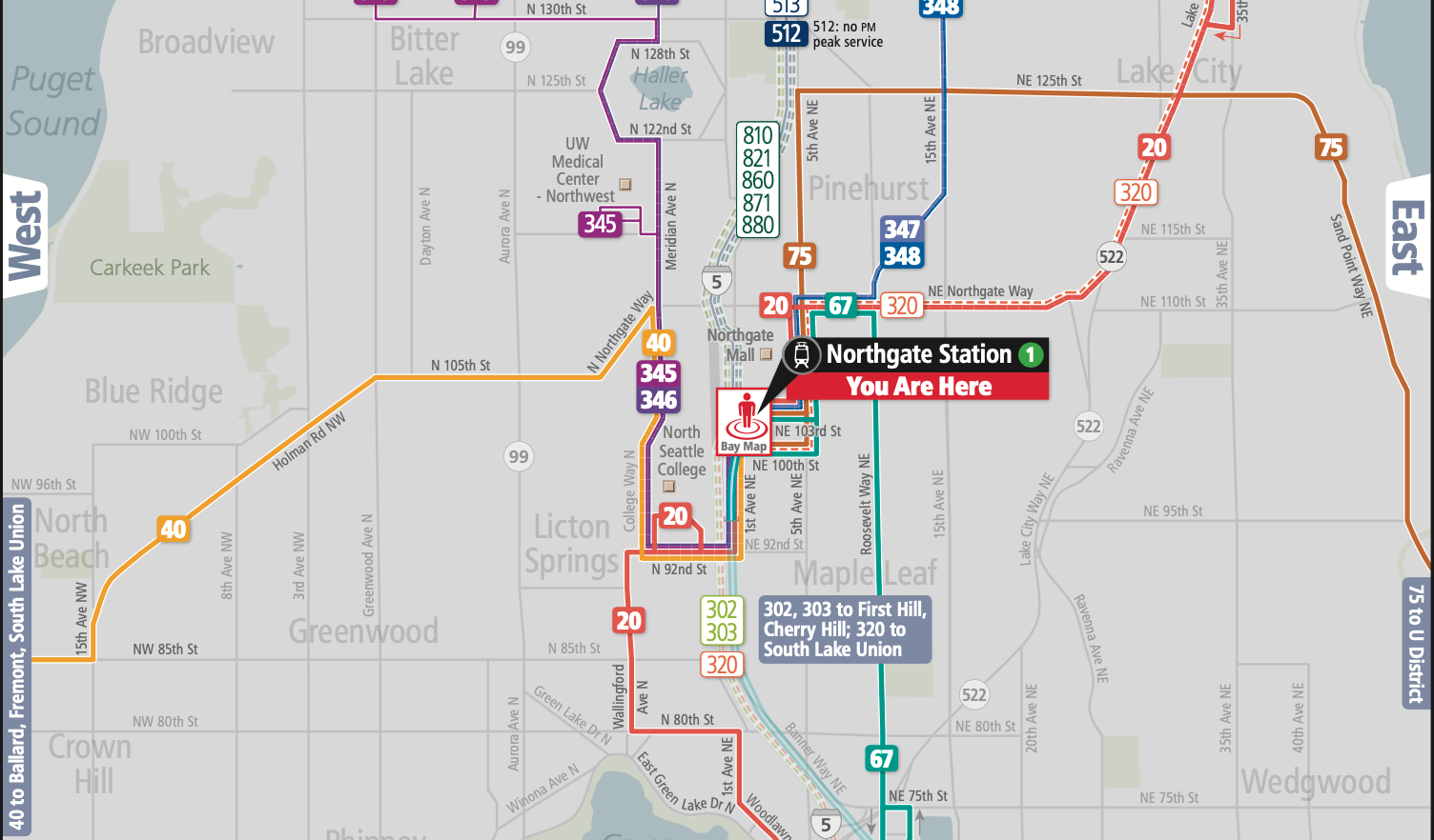
Ahead of the Northgate Link extension opening, King County Metro has quietly unveiled new area maps that will be located within light rail stations and at bus bays. The maps share some similarities to existing frequency area maps found in Downtown Seattle, but provide enhanced and streamlined details for riders. The new maps also show the fruits of Metro’s bus restructure in North Seattle, which adds some new bus routes, such as Route 20, and is aimed at improving connections to the new light rail stations — though pandemic budget tightening did cause the agency to abandon some ambitious earlier proposals, such as the crosstown Route 61.
Initially, the quartet of area maps will be located at the four North Seattle light rail stations only (click for Northgate, Roosevelt, U District, and University of Washington station area maps). That could change in the future depending upon outreach and feedback as well as funding being secured for wider implementation.
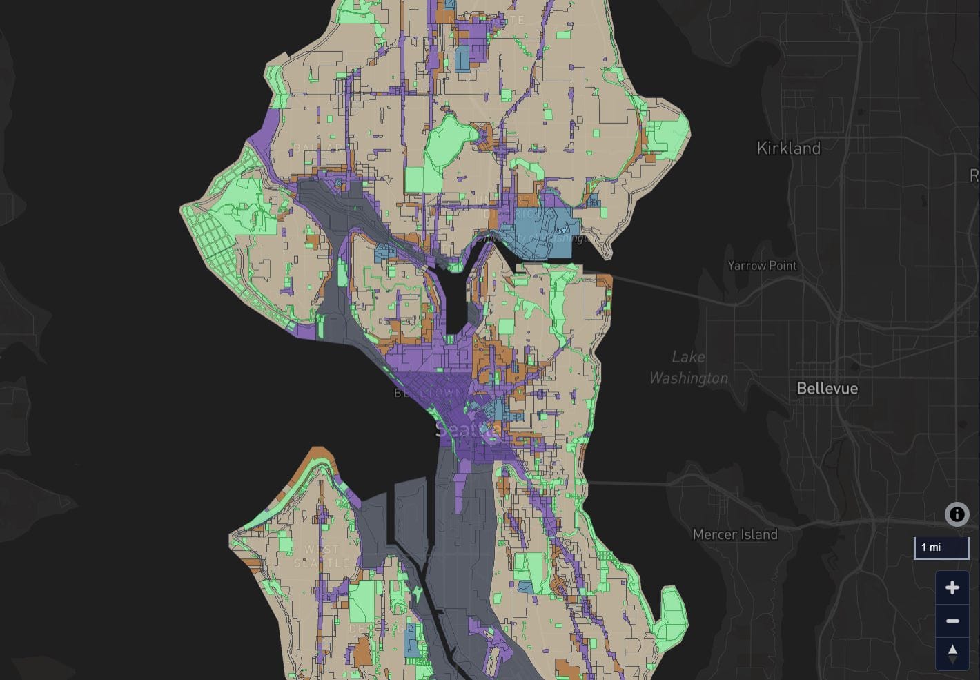
The map design approach emphasizes the location of light rail stations and frequency of bus routes that serve them, similar to spider maps found elsewhere around the globe. It also includes a full directory of routes and inset map that details bus bays and station exits.
Special icons call out light rail stations, including a red emblazoned “You Are Here” notice for the station that the map is located. Initially, the map only has a green Link 1 Line icon, but future iterations will presumably include additional line numbers and colors as the Link light rail network expands in the years ahead — the next extension opens in 2023 with the 2 Line running from Redmond Technology Station to Northgate Station. For now, though, the Link 1 Line is the region’s only light rail line, which is why most riders may not be familiar with the numbering system yet.
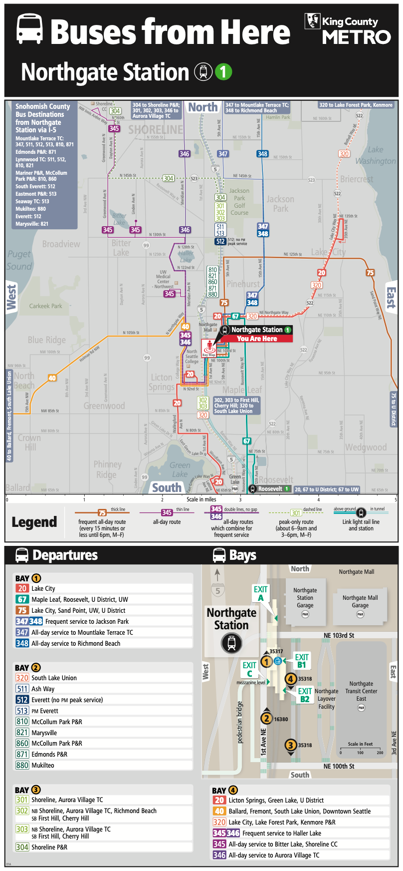
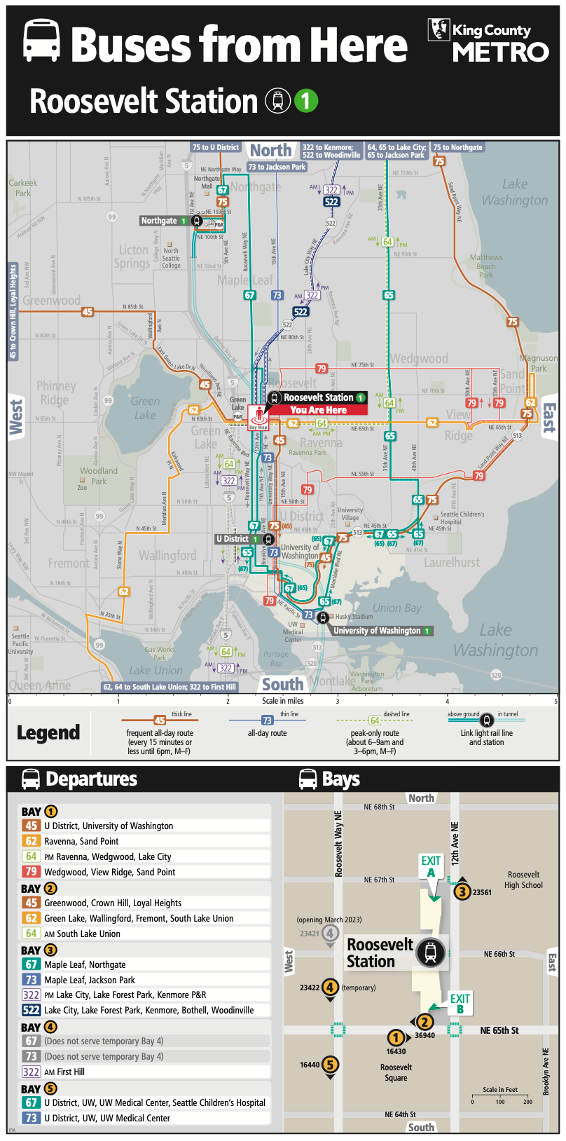
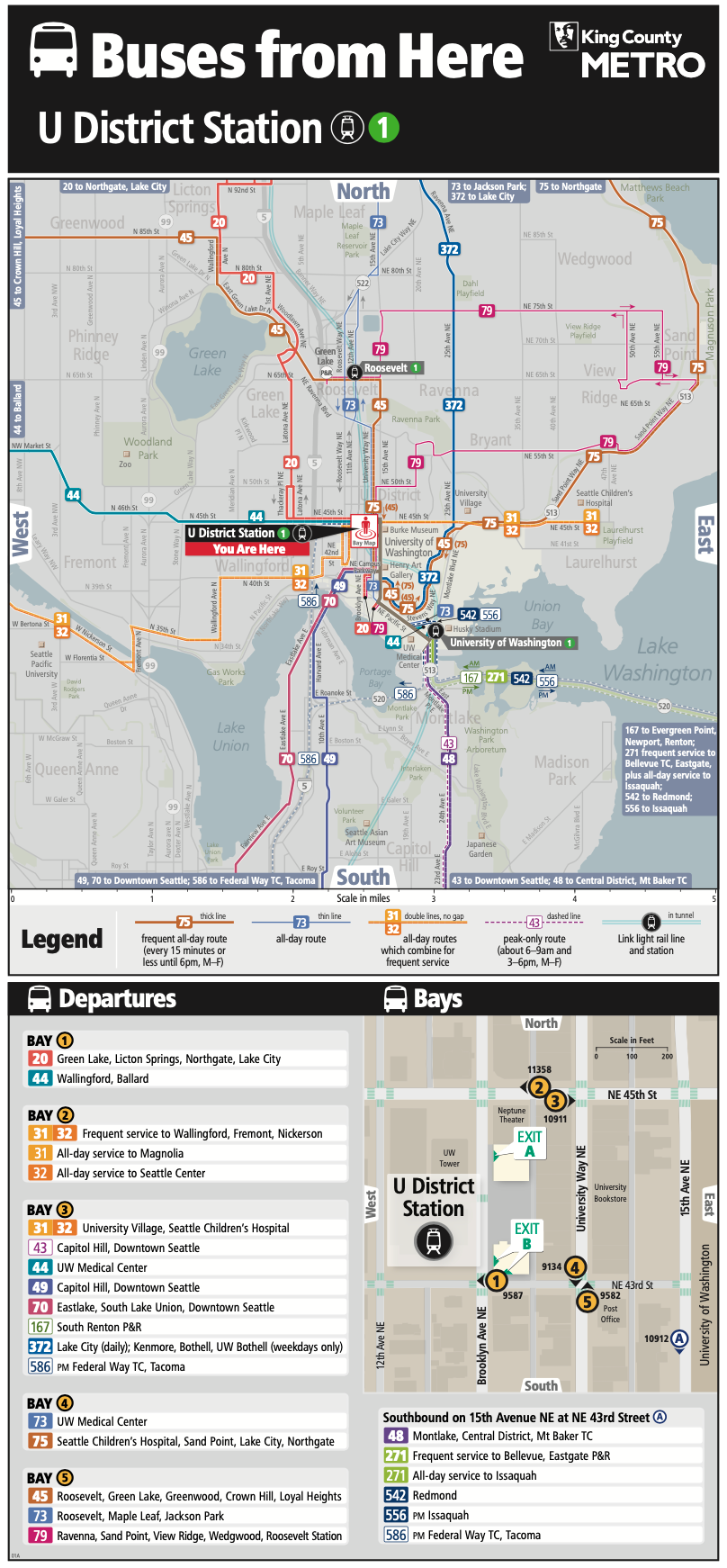
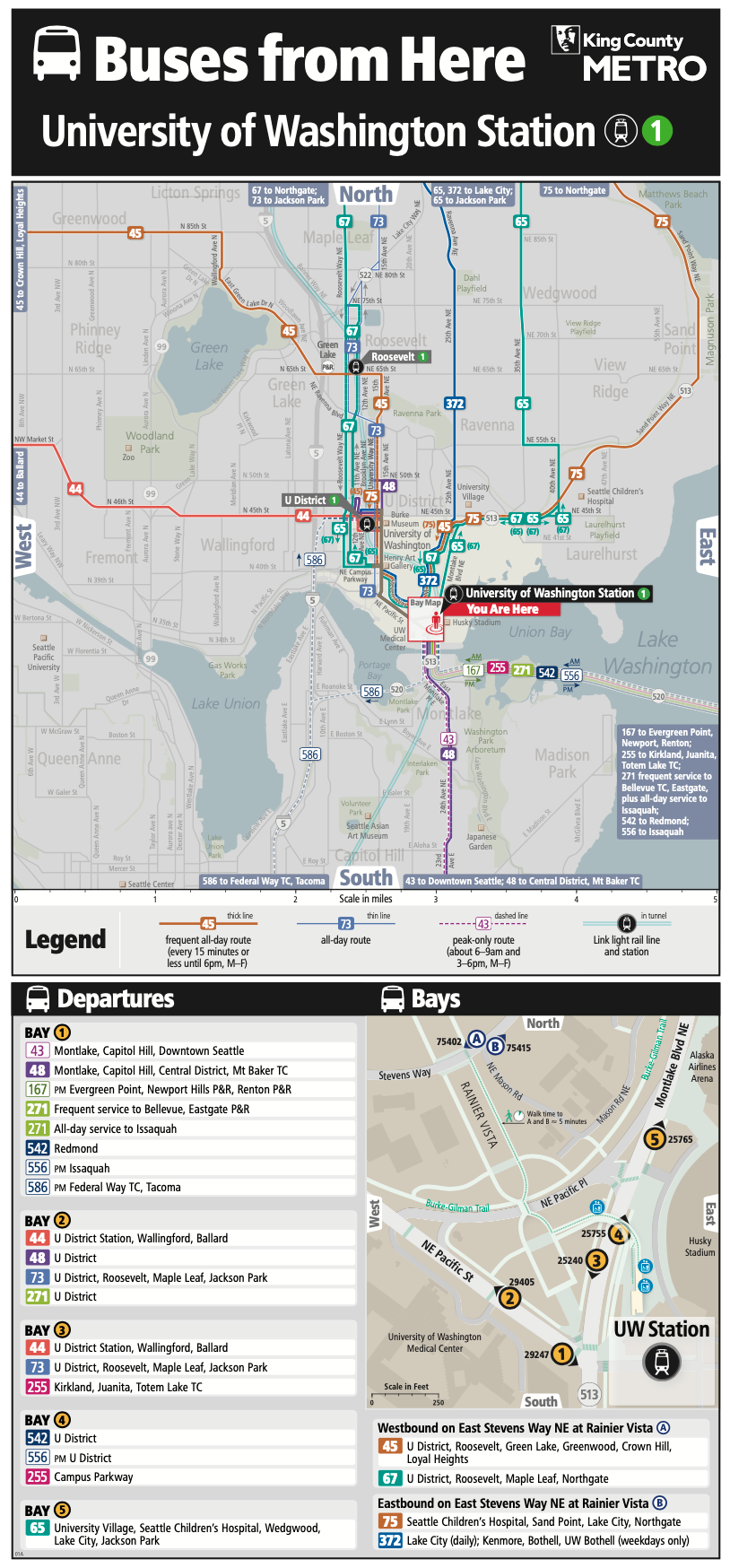
The primacy of light rail is subtly reinforced with the area maps drawing in the underground and aboveground portions of the 1 Line through Montlake, the University District, Roosevelt, and Northgate with two sea green lines. Again, light rail station icons also draw attention to station locations.
Bus routes are then emphasized on the map with individual colors and numbers. Frequent all-day routes — generally every 15 minutes or better during weekday daytime hours — are shown with thicker lines and bolder text. Conversely, all-day routes that are not frequent have thinner lines and unbolded text. In cases where two routes combine for frequent service on a corridor portion, they also are denoted with thicker lines and bolded text; numbers are stacked to clearly mark the relationship. Example of that are Routes 31 and 32 as well as Routes 347 and 348. Finally, peak-only routes are denoted with dashed lines and text on a white background, such as Routes 167, 301, 556, and 810; if peak-hour routes operate only in one direction, arrows and time of day are shown to help understand which way they run.
In limited circumstances, routes that operate in a series use the same color, such as: Routes 511 and 513; Routes 301, 302, and 303; and Routes 810, 821, 860, 871, and 880. Through-routed bus pairs like Routes 45 and 75 are carefully noted on the maps with special callouts to show where they continue as the alternative route number; colors of such routes are the same. And routes that run on couplets get callouts to show operational directions.
Below the area maps, directories show which bays that individual bus routes depart from. Again, these correspond to the map with the same colors and text treatment on the area maps. Along with these are inset maps that show the individual bus bays, station profiles and exits, elevators, and local street networks. The bay numbers match up between the directories and inset maps. Other helpful information in the inset maps are locations of crosswalks, station exit letters, and building profiles for additional visual context.
This kind of thoughtful wayfinding is a big investment in and improvement for the rider experience, especially amid a rather large bus restructure in North Seattle and North King County. It is also in keeping with the many ways that Metro, Sound Transit, and the City of Seattle are working to focus on seamless walking, rolling, and biking wayfinding tools.
Metro’s Fall Service Change Will Bring 14 Deletions, 7 New Bus Routes, 10 Revised Routes
Alphanumeric Lines Will Replace Colors and Names of Sound Transit Services
Sound Transit Updates Station Wayfinding and Seattle Implements New Street Wayfinding
Sound Transit Modernizes Signage and Wayfinding Scheme
Seattle Aiming to Launch Wayfinding Program in Early 2021 Following Covid Delay