Seattle has a history of infuriating maps. For its relatively young age as an official municipality, the place has produced amazing blood-boiling cartography.
Some maps are infuriating because they illustrate the city’s history of brutal oppression. Like this beautiful work by the Burke Museum’s Waterlines Project illustrates the city’s lost waterways and Coast Salish settlements before colonization by European descendants. It is a well done map with explanatory narrative and website to assist. It’s also striking because the eastward perspective makes us reconsider many things expected from a map. The orientation from the Sound looking inland to the east emphasizes waterways instead of the highways we’re used to. It’s a perspective indicative of a mindset associated with water rather than long ribbons of asphalt and a bit foreboding given we are looking towards where the colonizers are coming from.

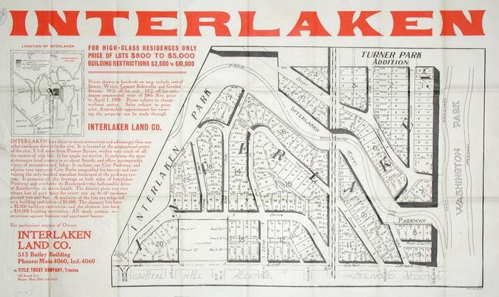
Other maps take a bit of interpretation to appreciate the horrors they show because the accompanying text is laced with old euphemisms. Like many developments that built the Seattle Times’ advertising fortune, this promo and map for Interlaken makes mention of the site being “restricted.” In that era, the restrictions were racial covenants. The signed and officially recorded deeds included text similar to that in Blue Ridge, which stated: “No person or persons of Asiatic, African or Negro blood, lineage, or extraction shall be permitted to occupy a portion of said property.”
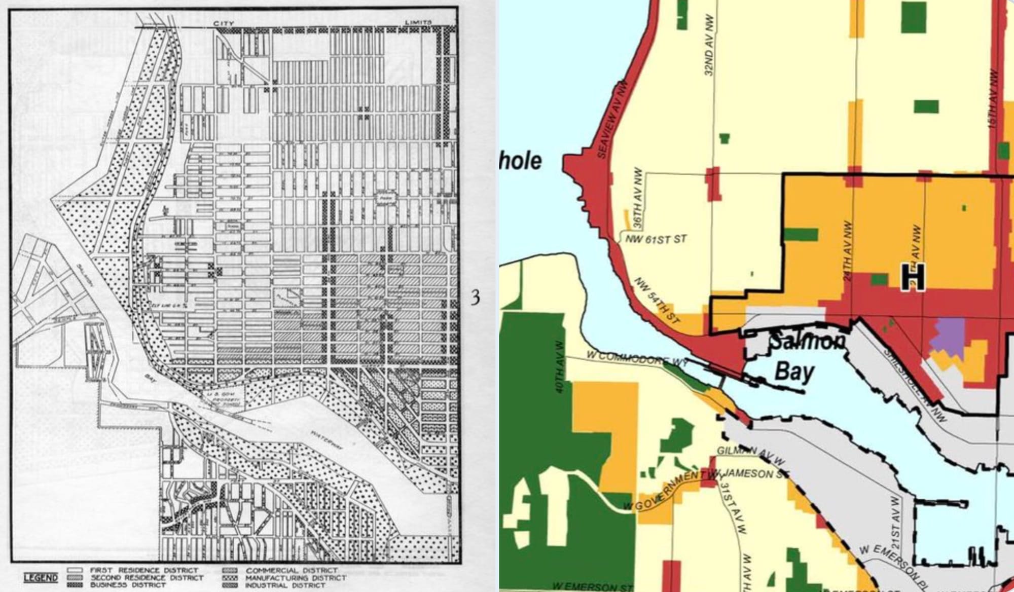
Finally, some maps require a comparison to really appreciate the glory of how infuriating they can be. The city’s first zoning map was developed in 1923. Looking at it 99 years later for an area like Ballard, it is possible to trace the exact same lines dividing commercial, manufacturing, and sprawling one-plexes. A century and 400,000 people later, these lines are somehow still there. They’ve outlasted 23 mayors and a tunnel boring machine named for the first mayor elected after the zoning was put in place.
But it’s time to add a few contemporary maps to this in Hall of Fame, and I have two entries. First, to figure out why they fit so well into Seattle’s unbroken chain of infuriating maps, it’s necessary to spend a moment thinking about very good ones.
What makes a good map?
The fine folks at ESRI think a lot about maps, given they have one of the best selling geographic information system (GIS) programs in the world. They do a whole lot of education around mapmaking targeted at supporting professionals who can all do better at conveying information. Even for someone who went through quite a few rounds of undergraduate cartography, the ESRI primers on making attractive and useful maps are essential references. If only to figure out why all your symbols just turned into purple hexagons.
On the design side, their instructions always come around to two important questions: Who is the audience? What’s the purpose or message you’re trying to get across? To do so well, cartographers and designers tend to create maps that fall into three main categories: the Infographic map, the Narrative map, and the Data Visualization map.
For one piece of information that can be understood quickly by most people, an Infographic map is the way to go. Your standard subway map is an infographic because it has one message and a simple set of colors and lines to convey it. We also see the infographic used in many public facing explainers. Large government documents get a lot of these, as well as executive summaries. Easy to peruse and understand, Infographic maps can sit on the very edge between a chart and a map. When well done, you receive a discrete piece of information to associate with a place.
When there is an epic story about a place, told for someone interested with some time, the map can get a narrative. So Narrative maps are the beautiful foldouts that fall from a National Geographic or get handed to you on entrance to a National Park. These are works of art, that can cover epochs since the cooling of the Earth’s crust or the wing patterns of butterflies. They are tied to a place with maps and words and pictures to add to the depth of our understanding of that place. Narrative maps tell the bigger story.
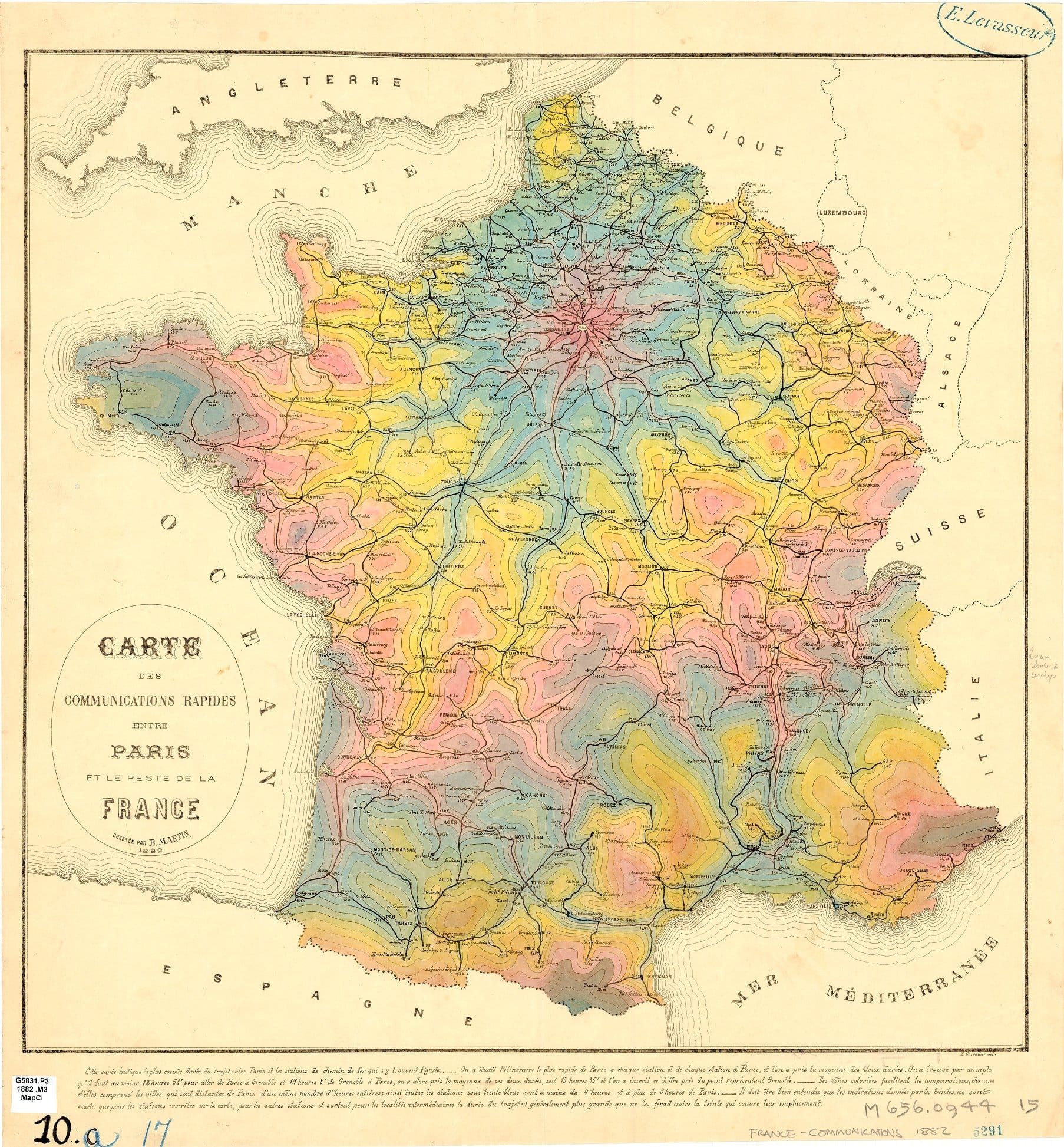
For big information and an expert audience, Data Visualization maps are the ones that make someone in a conference go “Oooooo, that’s not good.” They can take time to pour over, and may depend on the viewer’s expertise. To be honest, the best instances I’ve seen of Data Visualization are where the presenter is trying to illustrate a gap in knowledge. Too often, lots of flickering dots get thrown up and called Data Visualization because the author hasn’t figured out the real audience or message they’re trying to tell. But when it works, Data Visualization can create something as sublime and insightful as the famous French isochrone map that shows the changed shape of France based on time from Paris by rail.
Cartography, at its heart, is an editing process. Good map making is about focusing information because a map with all information is useless. It’s literally the world at full scale, which is not a map. And we live with an unimaginable amount of information on top of, under, and flowing through the visible universe of matter we see. Filtering it down to a single message is important. Making sure it’s received in the same way is vital.
The 2022 Infuriating Maps Hall of Fame inductees miss on both counts.
Focus
The base map for Seattle’s Industrial Lands Draft Environmental Impact Statement is our first 2022 Infuriating Maps HOF inductee. It is a simple enough map, showing the outlines of industrially zoned land in the city highlighting Interbay and the Duwamish. Throughout the Draft EIS, this map is the frame on which many Infographic maps are set. It’s used to show noise contours, location of landfills, future transit lines, and planned zoning. It gets used so much that it’s easy to miss a simple fact. This is supposed to be a city-wide zoning change, yet the map does not show the whole city.
The Industrial Lands EIS map enters the Infuriating Map HOF for what its focus tells us. While trying to set up a basic view to show many slices of information, it begs a deeper narrative story. The basic map is a paper doll that can wear outfits showing traffic impacts or housing density, yet we’re supposed to ignore the fact it doesn’t have a head because that’s not where shirts go. To be called “city-wide” and still omit the ten square miles of city north of 85th Street shows just how divided the city is. That is an unexpected message carried by the map.
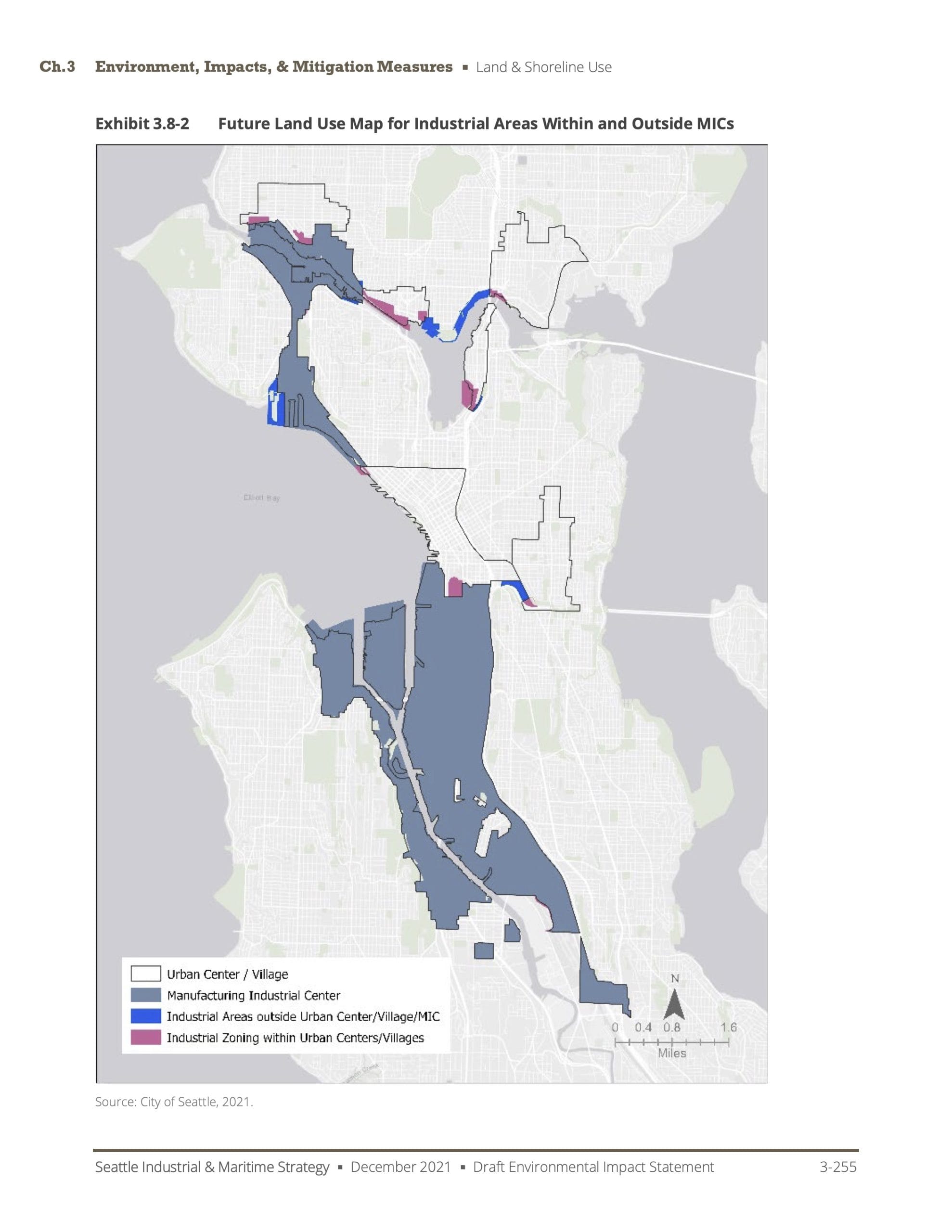
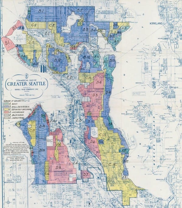
Unfortunately, hacking off the top of the city also calls to mind another infuriating map honoree — the most destructive map in the history of most American cities — the redlining maps from the 1930’s Home Ownership Lending Corporation. Seattle’s Draft EIS map echoes the ones used to block home loans from neighborhoods of color because those neighborhoods still form the outlines of industrial Seattle. And that 1930’s map also cuts off at 85th Street.
Such truncation made sense in the 1930’s because it was not until 1954 that Seattle annexed up to 145th Street. The area is still awaiting sidewalks promised in the deal.
And that’s where this Hall of Famer shines. The underlying message carried by the southern focus of the map is that there are no industrial lands north of 85th Street. The deeper message is that Seattle hasn’t made any important changes to land use, zoning, or neighborhoods polluted by industrial uses since the 1950’s.
Therefore: for wearing data like a headless paper doll; for redrawing a boundary that was abandoned in 1954; and for reminding us just how much of the 1930’s redlining maps are still in full force and effect, the Industrial and Maritime Draft EIS base map is a 2022 Infuriating Maps Hall Of Fame inductee.
Volume
The projected 2035 Freight Volume Map from Seattle’s Freight Plan is the second 2022 Infuriating Maps HOF inductee. The map and plan are actually a few years old, but have received renewed attention due to a city initiative that flattens the transportation maps into one at the expense of anyone outside of single vehicles and a transportation study that threatens to choke Interbay and surrounding neighborhoods with traffic and pollution.
The map traces the important freight routes throughout Seattle. For every increase in truck traffic on a segment of road, the line gets thicker. All of downtown and SoDo are inseparable blobs. Traffic spills off the roads and into Lake Union and Green Lake. No neighborhood is spared from the many amorphous tentacles of the Beast With a Thousand Engine Breaks.
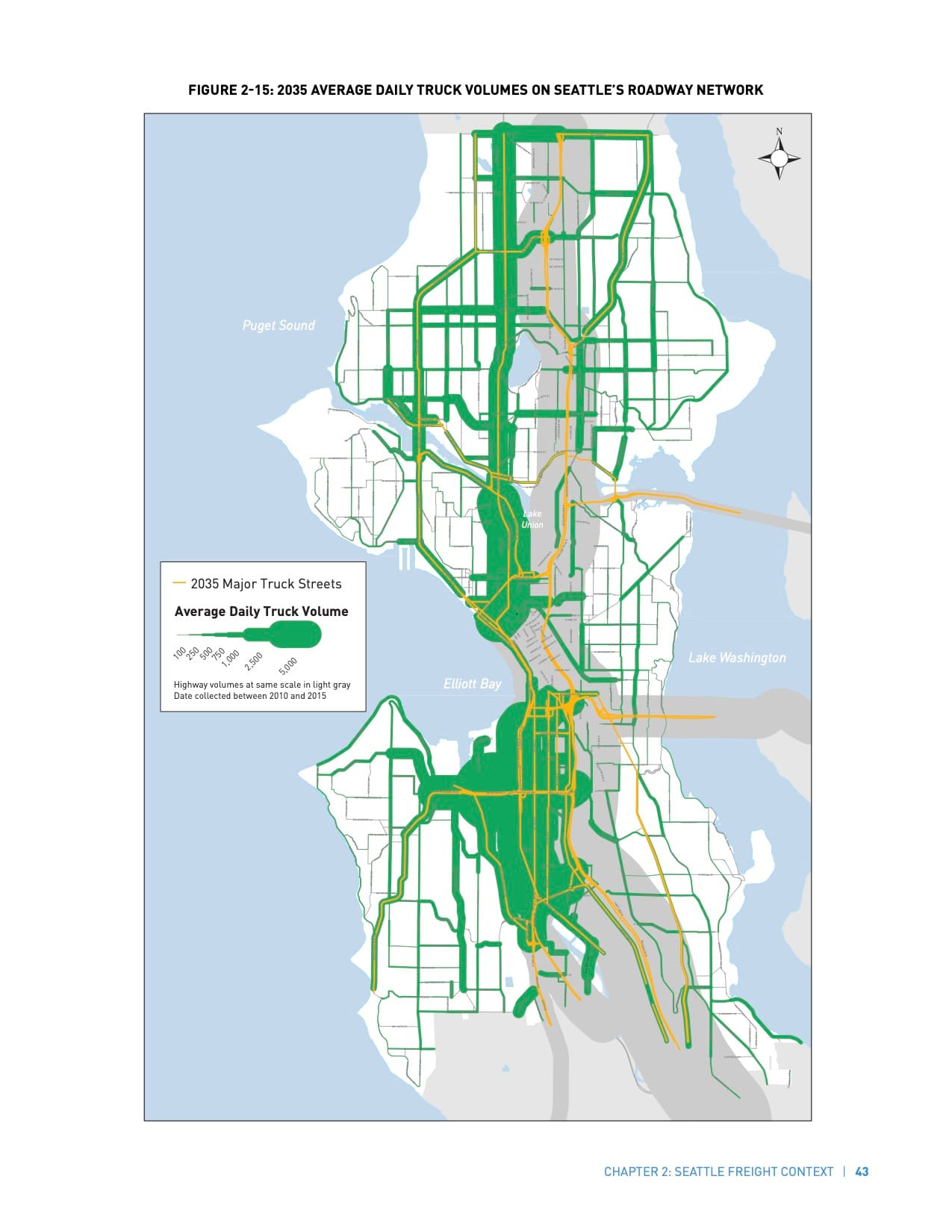
Thickening lines carries the implicit judgment that these roads are not wide enough for these uses. Illustrating with wider lines suggests the problem will be solved with wider roads. However, the statistics shout otherwise. Throughout Seattle, truck traffic tops out at no more than 4% of vehicles on the road. Truck volumes are nowhere near requiring wider roads. But when we overbuild based on terrible maps like this, the streets are flooded with cars. Trucks are blocked, and the vicious cycle starts again.
Making this map an infographic (single information, few colors) is an editorial choice. There are many ways of comparing road volumes, and the width of the line should not have been used. We see road volume maps every day. It’s a traffic map. And it uses colors to quickly and understandably convey how busy the arterials get.
The freight map is also a map of omission. In simplifying to just show truck traffic volumes, it omits how many of these corridors go through residential areas. It omits the number of apartments constructed immediately against these four- and six-lane surface highways. It omits how many windows open on these major freight routes. If that was shown, we would see why so many dense neighborhoods in Seattle are burdened with the highest levels of pollution. Seattle only zones density next to arterials.
Therefore: for using a fat marker where a colored pencil would do; for failing to recognize how many apartments were doused with soot under the breadth of that illustration; and for insinuating that anything would be improved with wider highways cutting up the city, Seattle’s Freight Volume Map is a 2022 Infuriating Maps Hall of Fame inductee.
The future of the Hall of Fame
Now, these maps may exit the Hall in the future. The Industrial Lands base map was part of the Draft EIS which will be followed up with a final report this summer. The city has the opportunity to correct the map, and received quite a few comments on that point. Let’s see if they do.
The Freight map is being reconsidered as part of the overall retooling of the city’s transportation plans. From the sound of it, the City Council is considering a map of even more extensive garbage. We hope that there will not be a reason to induct that one into the Hall aside its predecessor.
More broadly, Seattle is gearing up to renew its Comprehensive Plan. This will be an opportunity for the city to wipe away lots of the infuriating maps that mark so many terrible points in the city’s land use evolution. Or, we’ll have to build a whole new wing to the Hall of Fame.
The Seattle Times Found Many Ways to Profit From Exclusion and Redlining